Colour contrast is one of the simplest tools in design, yet also one of the most powerful. When two colours sit side by side with a strong difference in hue, brightness, or saturation, the eye reacts immediately. That reaction helps guide attention, shape emotion, and build meaning long before a viewer reads a word of text.
Contrast Can Set the Tone Before Anything Else
Design often leans toward harmony and subtle palettes, but contrast is what stops someone mid scroll. When used with intention, it becomes a form of storytelling.
A great example is the recent visual identity for Wicked 2. The promotional artwork pairs vibrant green with intense pink. The combination feels supernatural, dramatic, and slightly chaotic. Even without context, the colours signal energy and conflict, which fits the world of Wicked perfectly.

Wednesday takes a different approach. Its black and pink palette mixes gothic darkness with a bright, punchy edge. That contrast hints at mystery, style, and a rebellious attitude. Before any imagery or typography enters the frame, the colours alone communicate personality.

Why Contrast Works
More Examples of Effective Contrast
Horror and thriller posters
Many posters in these genres rely on sharp contrasts. Pale figures on black backgrounds, stark red titles against muted tones, or glowing highlights that isolate the subject. The contrast creates tension and tells the viewer what kind of story they are stepping into.

Web and app interfaces
Accessible design depends heavily on clear contrast. High contrast between text and background supports readability for all users. Contrast is also essential for guiding interaction by highlighting buttons and navigation.
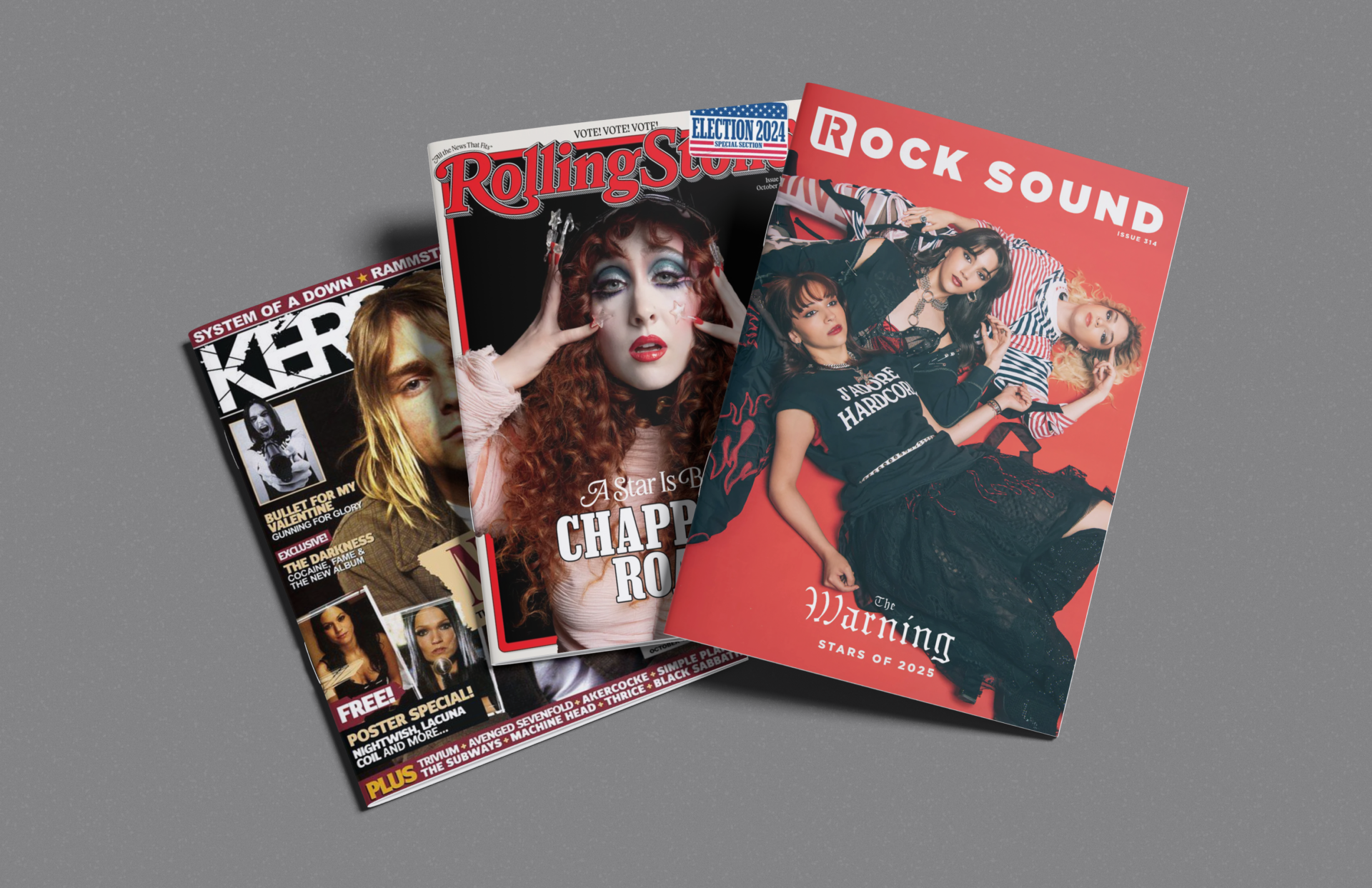
Album covers
Music branding often uses strong colour pairings to reflect genre or emotion. Dark backgrounds with bright accents, or minimal palettes with one high contrast element, are common choices that create instant recognition.

Packaging and retail design
Products often rely on contrast to stand out on the shelf. Unique colour pairings signal quality, style, or flavour. A well chosen clash can become a recognisable feature of a brand.

Using Contrast with Intention
Contrast is powerful, but too much of it can overwhelm a design. When everything demands attention, nothing stands out. The key is purpose. Choose the moments where contrast should lead the viewer and let the rest of the design support that choice.
Colour contrast is more than a stylistic choice. It shapes meaning, creates emotion, and helps audiences instantly understand the world a design belongs to. Whether you are crafting a film poster, a UI layout, or a visual identity, a well chosen contrast can turn a simple palette into a memorable experience.