Science fiction often lives or dies by how believable its world feels. Not just in terms of story, but in how that story is visualised. With Project Hail Mary, the shift from page to screen brings something new into focus. It is no longer just about the idea of space, but how that space is designed, framed, and experienced visually.

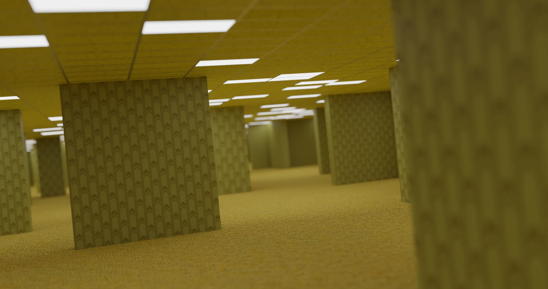
At its core, Project Hail Mary is a story about isolation. That idea translates directly into design. The interiors of the spacecraft lean into clean, functional layouts, with limited colour palettes and controlled lighting. Whites, greys, and muted tones create a sense of sterility, reinforcing the idea that this is an environment built purely for survival. There is no excess, no decoration, only what is necessary.

This kind of restraint is what gives the film its visual strength. When colour is introduced, it carries weight. Inside Grace’s ship, even the smallest accent becomes significant. A warning light or interface screen does not just exist for realism, it becomes a focal point. These controlled bursts of colour guide the viewer’s eye and reinforce the idea that every element has a purpose.
That sense of control makes the introduction of the unknown far more impactful. As the film moves beyond familiar human design, colour and form begin to shift. The astrophage sequences are a clear example of this. Space, which is typically presented as a cold, empty void, is transformed into something entirely different. Deep blacks give way to rich reds, shimmering particles, and glowing movement. The result feels almost comforting rather than threatening, turning emptiness into something alive and visually engaging. It changes the emotional tone of space itself, showing how colour can redefine an environment without altering its scale.


Framing plays a huge role in reinforcing these ideas. Shots that place Grace alone within vast stretches of space emphasise vulnerability, while tighter interior compositions reinforce confinement. The contrast between these approaches builds tension without relying on dialogue. The viewer is made to feel both exposed and contained, depending on where the camera is placed.

This contrast becomes even more striking when Grace boards Rocky’s ship. After spending so much time in confined, human-made interiors, the shift in design is immediate. The space feels vast and open, with no clear edges or boundaries. It lacks the rigid structure and visible constraints of Grace’s own environment, replacing them with something more organic and difficult to fully comprehend. The framing allows the space to feel endless rather than enclosed.

Within this environment, light behaves differently. One of the most memorable moments comes when a rainbow reflects across Grace’s suit, introducing a level of colour that has barely been seen up to that point. It is a small detail, but it carries weight. In a film that has been so visually restrained, that burst of colour feels almost overwhelming. It signals a shift not just in location, but in understanding. The unknown is no longer distant, it is surrounding him.

What makes all of this effective is consistency. The design of the ship, the use of colour, the framing of shots, and the portrayal of space all follow a clear visual logic. Nothing feels out of place because every element supports the same core ideas of isolation, survival, and discovery.
Project Hail Mary shows how design can carry meaning without explanation. Colour defines emotion. Light defines presence. Composition defines scale. When these elements work together, the world becomes believable, not because it mirrors reality, but because it follows its own rules with complete confidence.
The film succeeds because it treats every frame as a designed space. That approach is what turns a story about survival into an experience that feels immersive, intentional, and visually unforgettable.