
Good design is often defined by what we can see. The typography, imagery, colour, shapes and layouts all compete for our attention. But sometimes, one of the most important parts of a design is the space where nothing is happening.
Negative space, sometimes called white space, is the empty area surrounding and between visual elements. It gives designs room to breathe, helps establish hierarchy, and can completely change the way we interpret what is on the page.
It can also become part of the message itself.
A well-known example is the FedEx logo. At first glance, it is simply a wordmark, but the space between the final E and X creates a subtle arrow. The empty space becomes an active part of the identity, reinforcing ideas of movement and direction without adding another graphic.
This kind of visual trick demonstrates just how much information can exist within an absence of content. The viewer is encouraged to look twice, discover something hidden, and remember the design because they have participated in finding it.

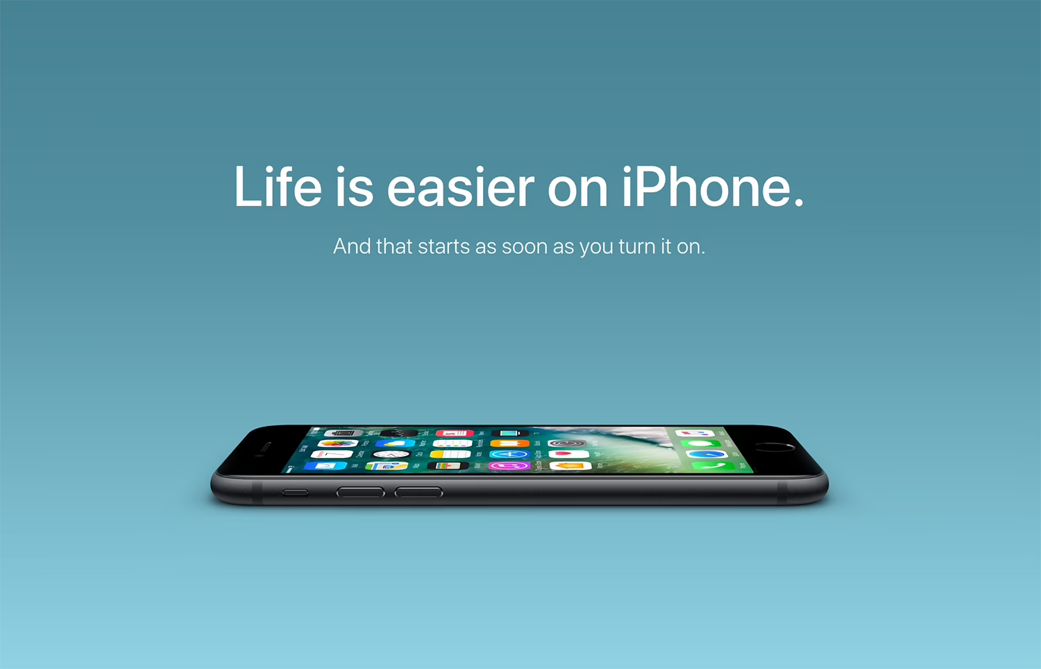
Consider the classic Apple advertising style. Large areas of empty space often surround a single product or image, giving it room to dominate the composition. There is little competing for attention, so the viewer’s eye naturally settles on the subject.
Film, television and even games use negative space in much more atmospheric ways.
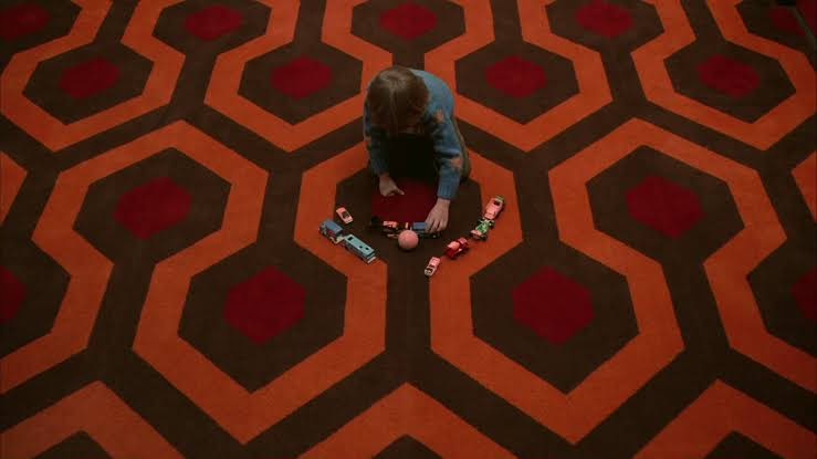
In The Shining, characters are frequently positioned within enormous, carefully composed environments. The empty space around them can make them appear isolated or vulnerable, turning the background into part of the storytelling. The same technique can create anticipation in horror, where leaving an area of the frame empty makes us wonder what might enter it.
Games use this principle too. Journey frequently places its small player character against vast desert landscapes. The enormous amount of empty space makes the environment feel almost endless, while also emphasising the scale of the journey. The player becomes a small figure moving through a much larger world.

Negative space does not have to mean a completely empty area, either. It can be created through contrast, colour, composition or even the arrangement of objects.
A bright subject against a plain background creates visual space around it. A minimal website can use generous margins to separate sections. A poster can leave half of its surface almost completely empty, allowing a single piece of typography to become the focal point.
The important thing is intention.

When every part of a design is competing for attention, nothing becomes particularly memorable. Negative space gives individual elements room to have an impact. It establishes rhythm, separates information and makes the important parts feel important.
There is also a psychological element to this. Crowded visual environments can require more effort to process, while considered spacing can make information feel easier to understand. This is particularly important in digital design, where users are already navigating menus, notifications, images and text.
For graphic designers, negative space can therefore be just as valuable as any visual asset. It can communicate hierarchy, create emotion, hide visual details, and even become part of a brand’s identity.
Sometimes the most effective decision in a design is knowing what to leave out.