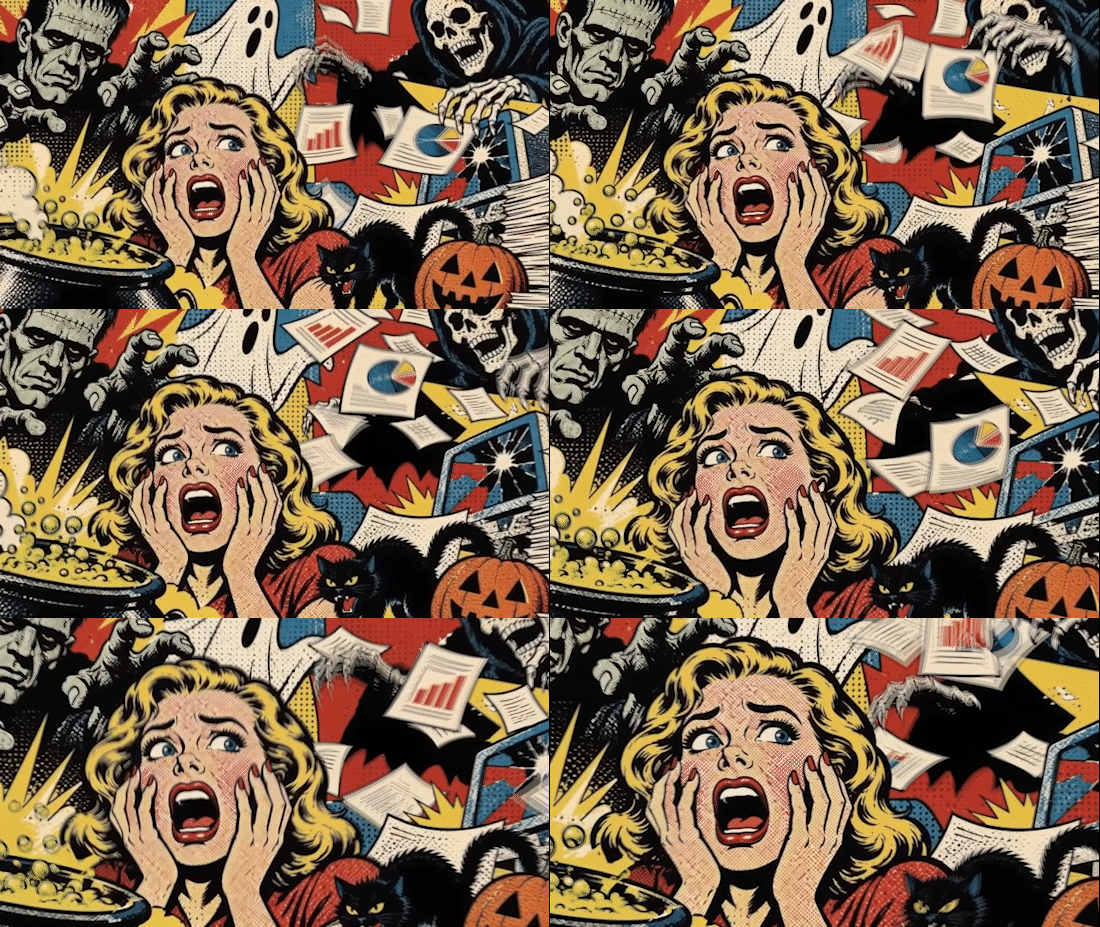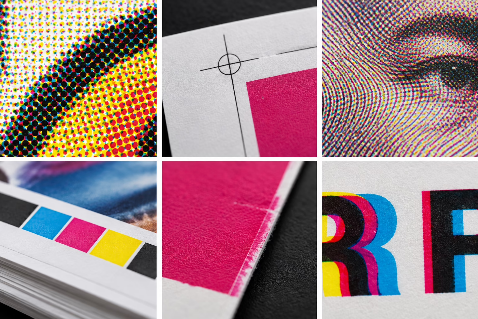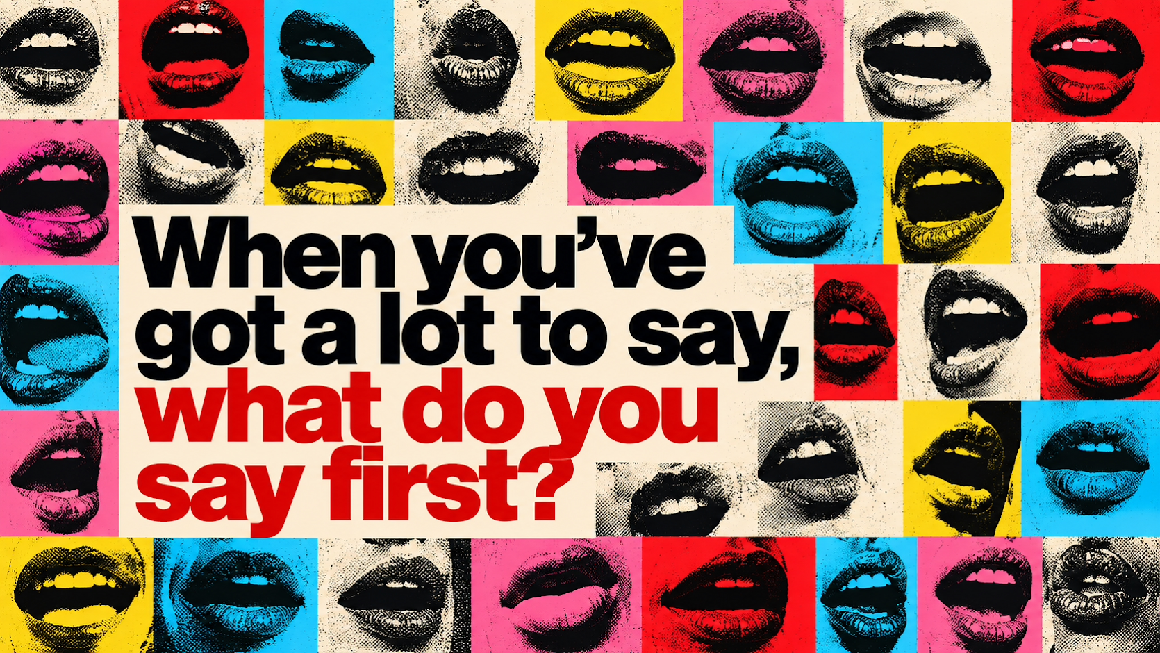

Few colours make an impression quite like red. It can signal danger, suggest violence or demand attention before we’ve even had time to process what we’re looking at. In horror, these associations make it a powerful tool for creating tension, building atmosphere and making images unforgettable.
Setting the scene
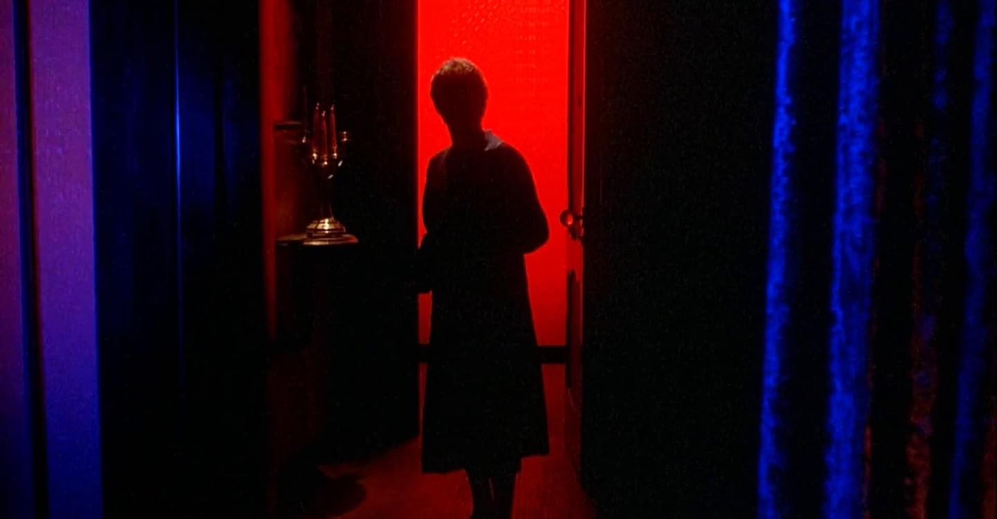
Red doesn’t always need to represent blood to feel unsettling. In Suspiria (1977), vivid red lighting transforms ordinary rooms into dreamlike, threatening environments. The intense palette becomes central to the film’s identity, showing how colour alone can shape the mood of an entire scene.
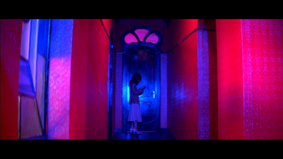
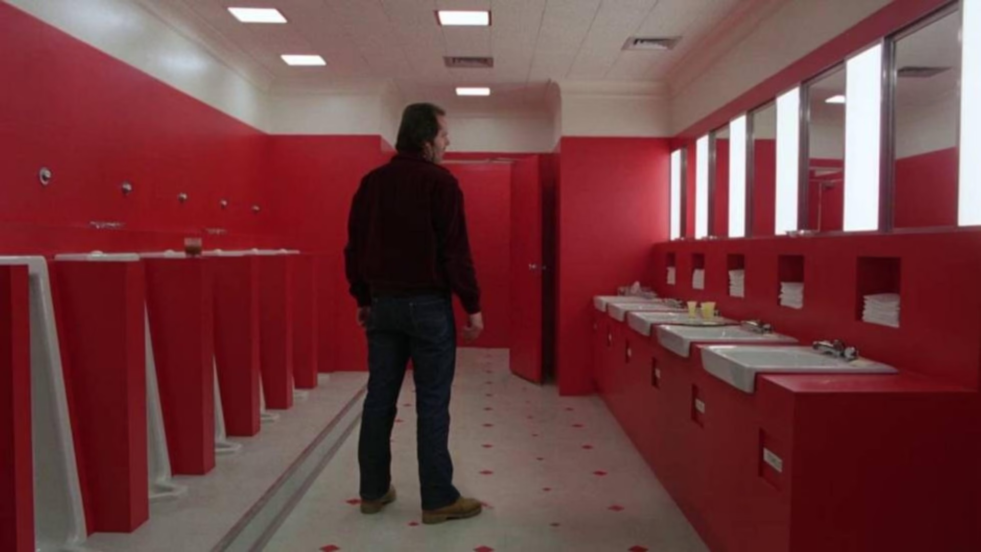
In The Shining (1980), red works alongside geometric patterns, rigid compositions and enclosed spaces to create a different kind of unease. The effect comes from how the colour interacts with its surroundings, reminding us that the same shade can feel welcoming in one context and threatening in another.
The power of contrast
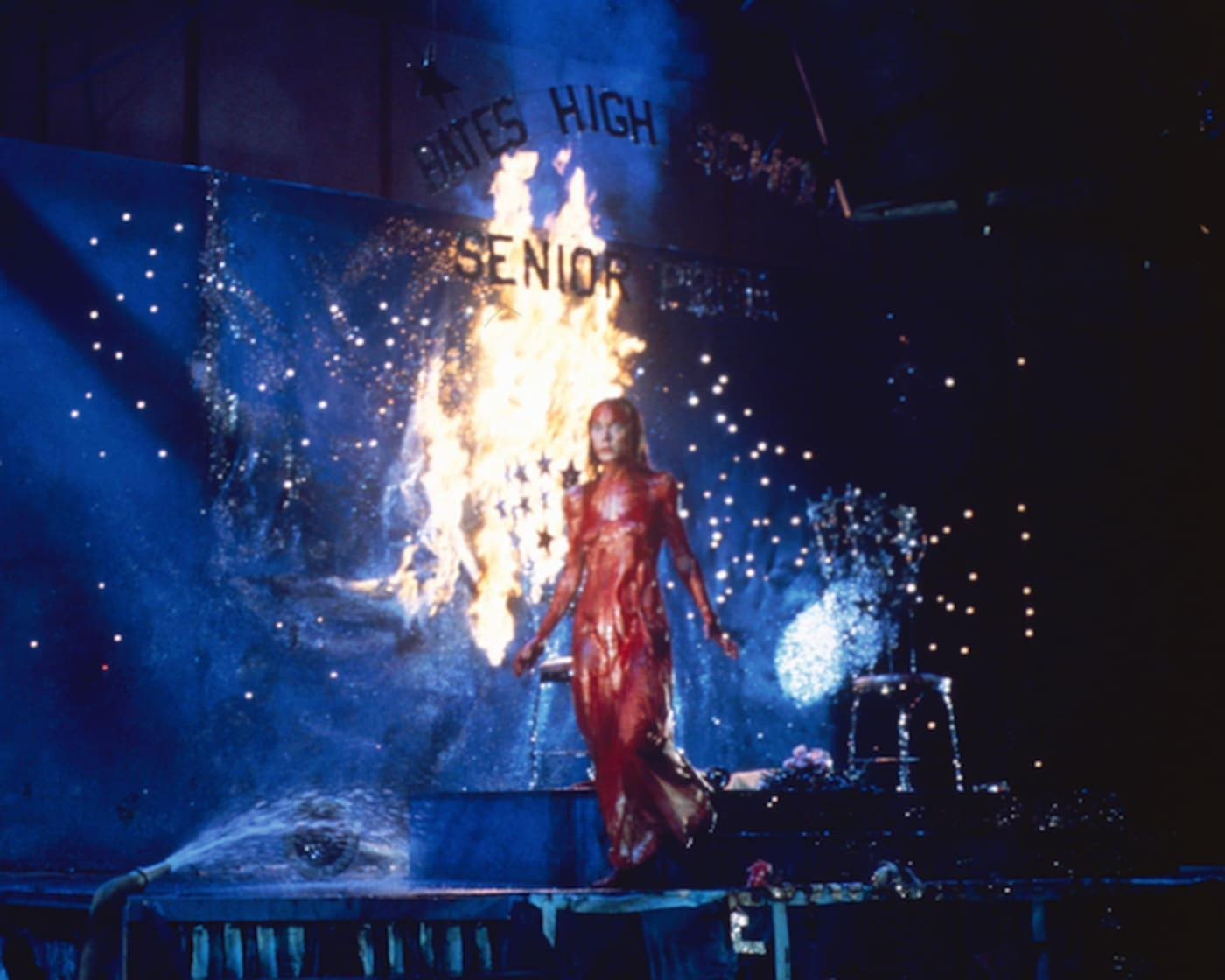
Some of horror’s most memorable imagery comes from placing red against a contrasting colour. In Carrie (1976), the red blood against Carrie’s pale prom dress creates an instantly recognisable image. The contrast draws the eye straight to the colour, making the moment difficult to forget.
Graphic design uses the same principle. A red title against a black background, or a single red detail within a largely monochrome composition, can establish hierarchy and direct attention without overwhelming the viewer. Sometimes, a small amount of colour has more impact than filling the entire design with it.
Making colour count
Red has become a staple of horror because its associations are already familiar to us. But its meaning depends on how it is used. Typography, composition, lighting and surrounding colours all influence whether it feels dangerous, dramatic or bold.
For designers, horror offers a useful reminder that colour is more than decoration. Used with purpose, it can establish a mood, guide the viewer’s attention and make an image memorable long after they’ve looked away.