
When a piece of printed collateral looks polished on screen, it’s easy to assume the finished result will look exactly the same. Print, however, can introduce problems that aren’t always visible during the design process.
Whether its incorrect bleed settings or colour conversions, small artwork mistakes can become expensive once hundreds or thousands of copies have been produced. Here are five common issues worth checking before sending high-end print to production.
1. Forgetting the bleed
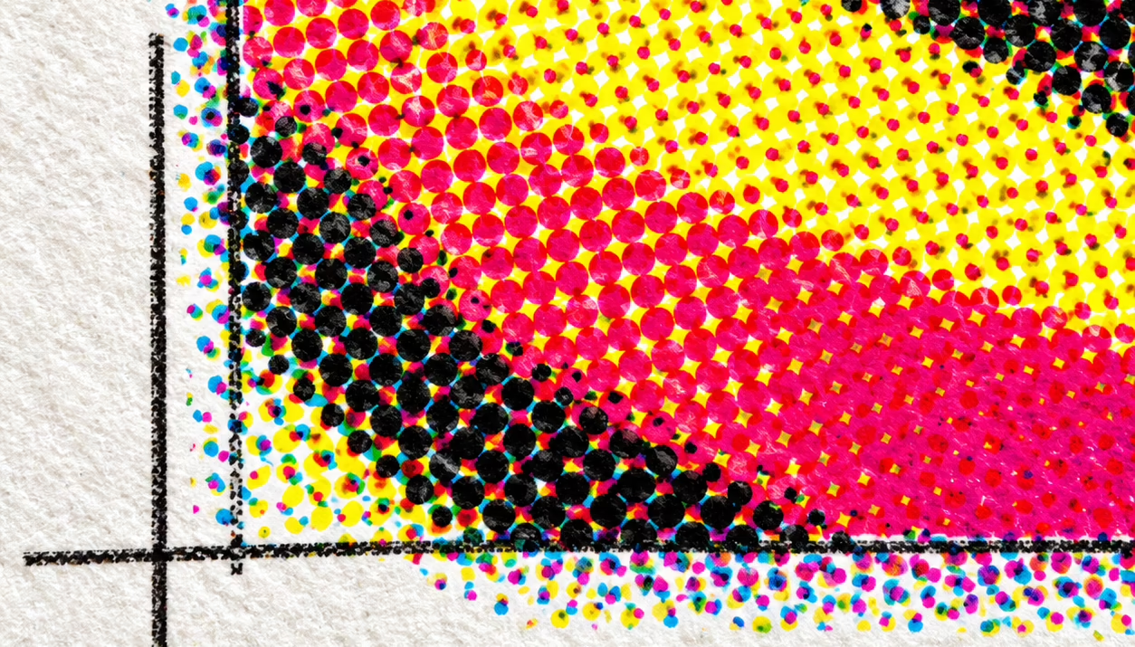
Anything that runs to the edge of a printed page needs to extend beyond the final trim line. This extra area, known as the bleed, gives the printer some tolerance during trimming.
Without it, even a small shift can leave a thin white line around the edge of the page.
Adding the correct bleed from the start is much easier than fixing it when the artwork is ready for print.
2. Using low-resolution images
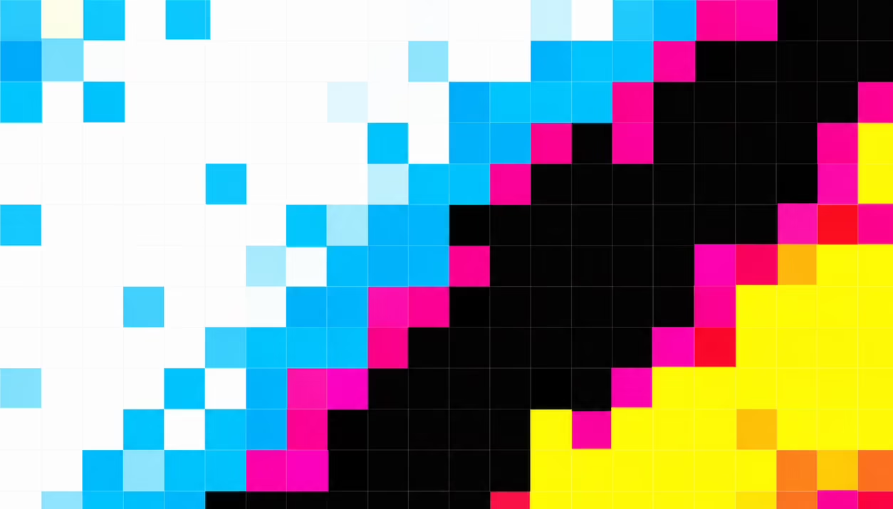
An image can look perfectly sharp on screen and still be unsuitable for print.
A photograph that works at a small size online may become noticeably soft or pixelated when enlarged across a brochure page. Always check image resolution at the size it will actually be printed, particularly when using large photography as a major part of the design.
3. Getting RGB and CMYK wrong
Screens use RGB, while commercial printing generally uses CMYK. Converting between the two can change how colours appear, particularly with bright or highly saturated colours.
For established brands, this can be particularly noticeable. Preparing artwork using the printer’s required colour profile and checking important brand colours before production helps avoid unexpected results.
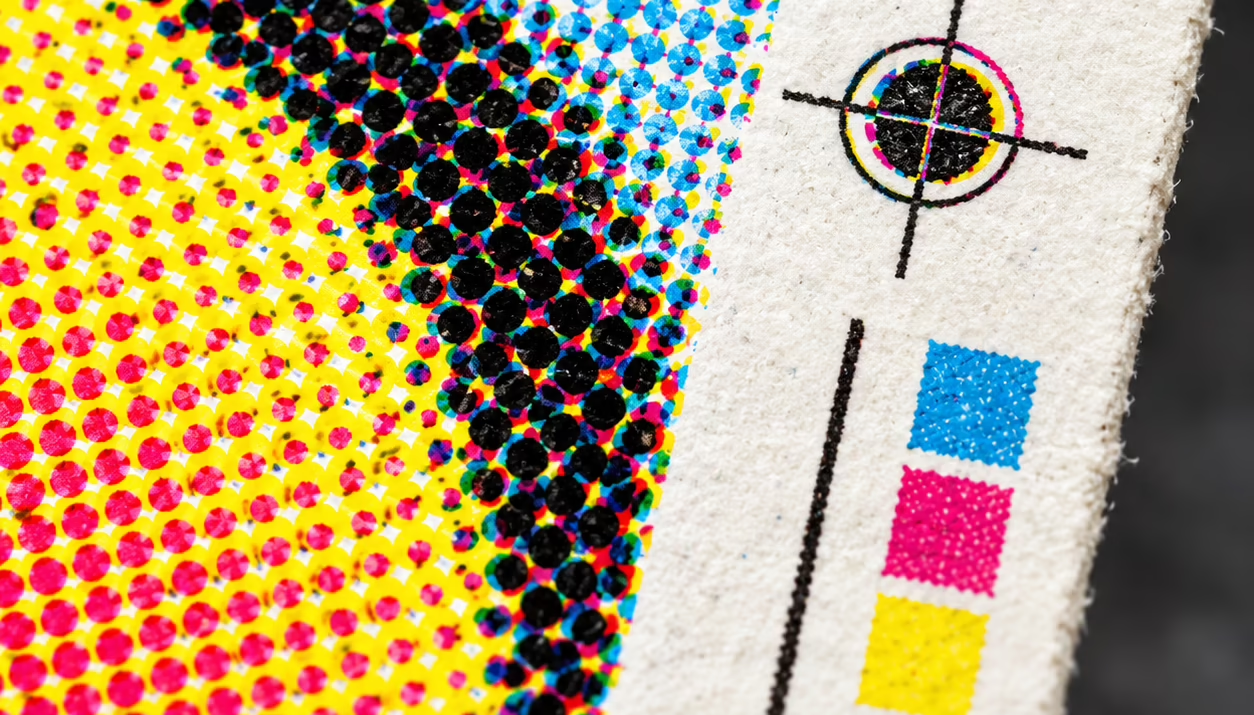
4. Assuming black will always print as black
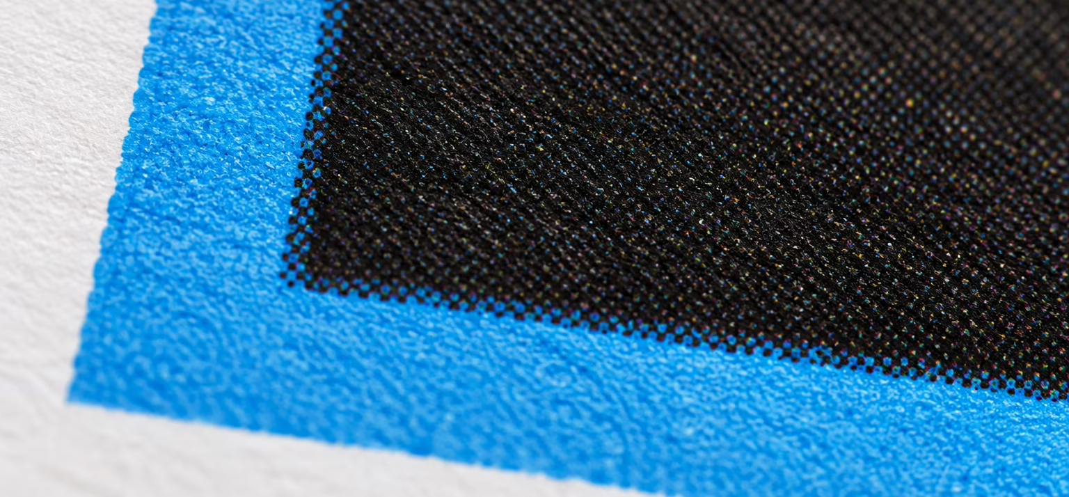
We recently came across this first-hand when a client brought us a brochure they had produced in-house, where photographs were faintly visible through borders that were intended to be solid black.
The photographs extended beneath the borders, and the black fill wasn’t sufficient to completely conceal them in print.
We resolved the issue by changing the large backgrounds to rich black and cropping the photographs so they no longer extended beneath the borders. We also recommended a physical proof before the next print run.
The takeaway is that black needs consideration too. Check black values and overprint settings with your printer, and make sure images aren’t extending underneath areas where they could become visible. Rich black can be useful for large areas, while small body text should generally remain single-colour black for sharp reproduction.
5. Skipping the final artwork check
Before sending anything to print, it’s worth checking more than whether the design looks good.
Bleed, image resolution, colour profiles, fonts, links and document dimensions should all be checked against the printer’s requirements. A quick physical proof can also reveal issues with scale, spacing or readability that aren’t always obvious on screen.
Good print starts before the printer
The difference between a successful print run and an expensive reprint can come down to details that are almost invisible during the design process.
At Fresh01, we work across both the creative and production sides of print, making sure the work doesn’t just look right on screen, but arrives from the printer looking the way it was intended.