Every October, brands lean into the dark. Logos turn black, typefaces distort, and orange creeps into every palette. Halloween invites experimentation, letting designers embrace imperfection and push tone and texture further than they usually can.
But for some, unease isn’t seasonal. Horror films, gothic musicians, and dark fashion labels live in that space all year round. What most brands try on for a few weeks, they have built their identities around. For their audiences, it isn’t a gimmick. It’s authenticity. Unease works because it lingers. It makes you feel before you even think, and that emotion is what makes design memorable.
The Saw logo remains one of horror’s most recognisable symbols. Its jagged, scarred lettering feels cut from metal, mirroring the film’s themes of brutality and survival. It is not slick or polished; it is raw, unsettling, and immediately communicates danger. That is the power of imperfection used with purpose.
The Witch takes the opposite approach. Its stark black-and-white imagery, the archaic spelling “The VVitch,” and symmetrical composition all suggest refinement, but it is a refinement that feels slightly off. The balance is uneasy, the calm suffocating. It shows that unease can be quiet, elegant, and deeply psychological.
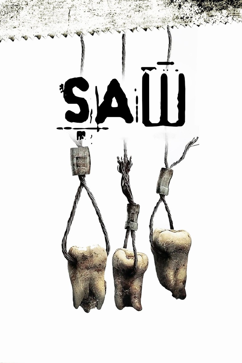
Poster for “Saw III” (2006), directed by Darren Lynn Bousman. Artwork © Lionsgate Films.
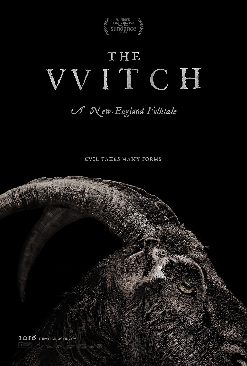
Poster for “The Witch” (2015), directed by Robert Eggers. Artwork © A24.
Where films like Saw and The Witch show unease in storytelling, Siouxsie Sioux and Robert Smith show it in personality and branding. Their visual identities, the smeared eyeliner, shock-white faces, and towering black hair, became as defining as their music. It is a complete aesthetic language that extends across album art, photography, and performance.

Credit: Fin Costello / Redferns / Getty Images
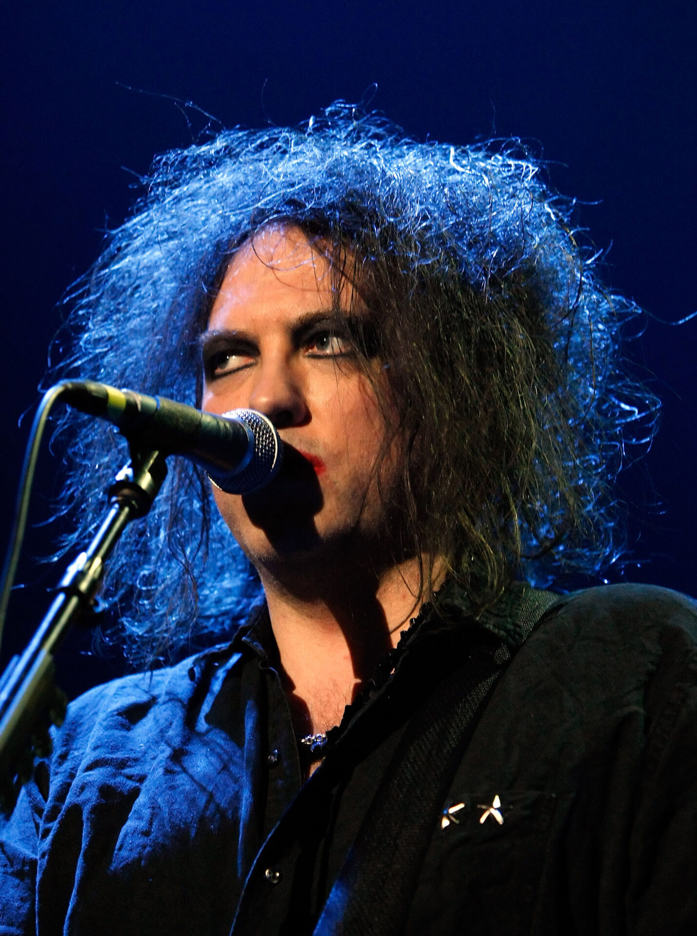
Credit: Ethan Miller / Getty Images
Their use of contrast, shadow, and minimal colour mirrors the emotions in their sound: romantic, melancholy, and defiant. This consistency made them instantly recognisable. They followed their brand identity to perfection, proving that in design, staying true to an unsettling visual world can be far more powerful than chasing trends.
Book designers have long understood how typography sets tone in gothic storytelling. From Dracula to Mexican Gothic, a serif font that bleeds at the edges, letters that fade like old ink, or a subtle emboss that catches the light can evoke age, mystery, and decay. The cover becomes a door to another world before a word is even read.
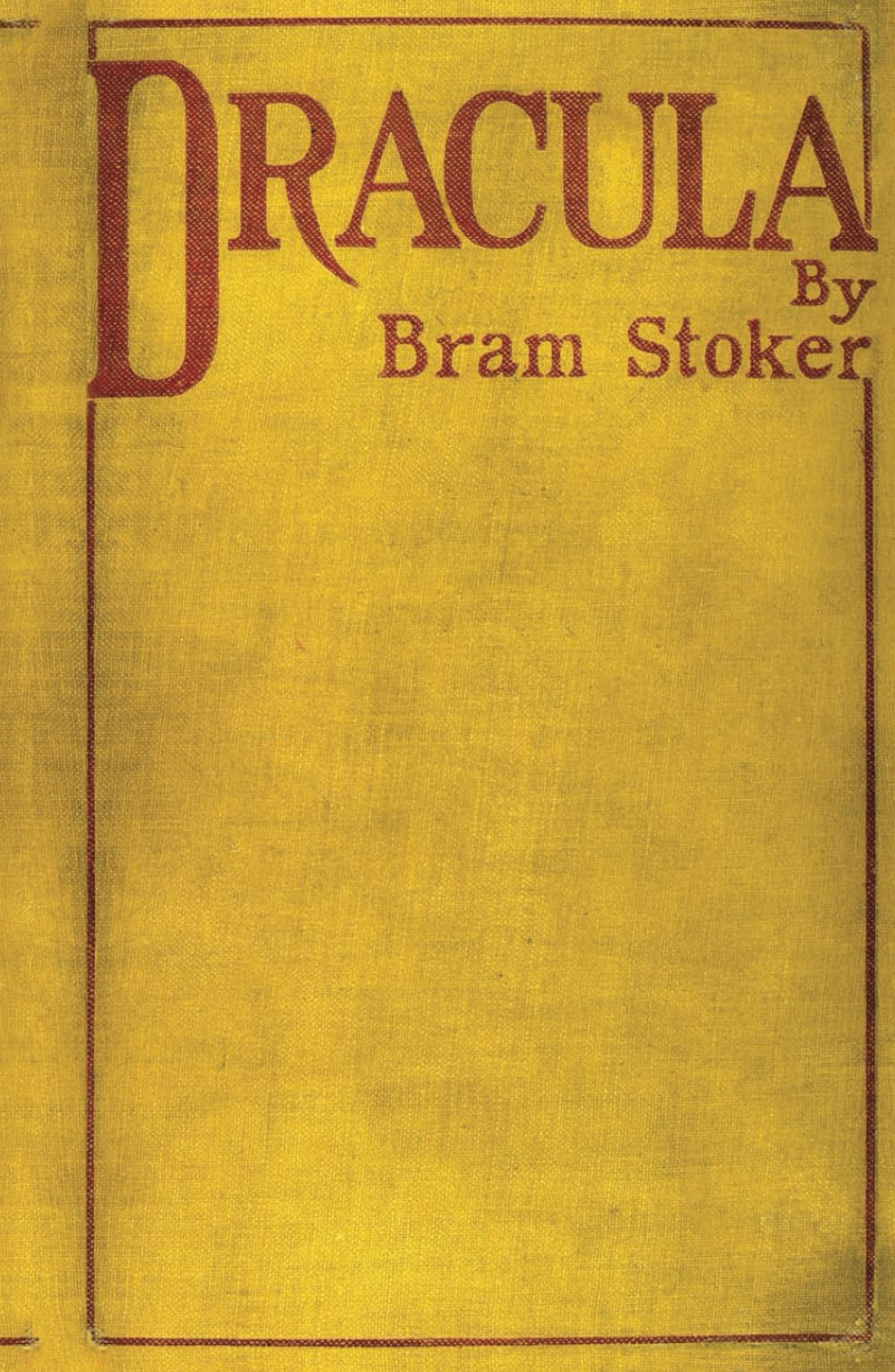
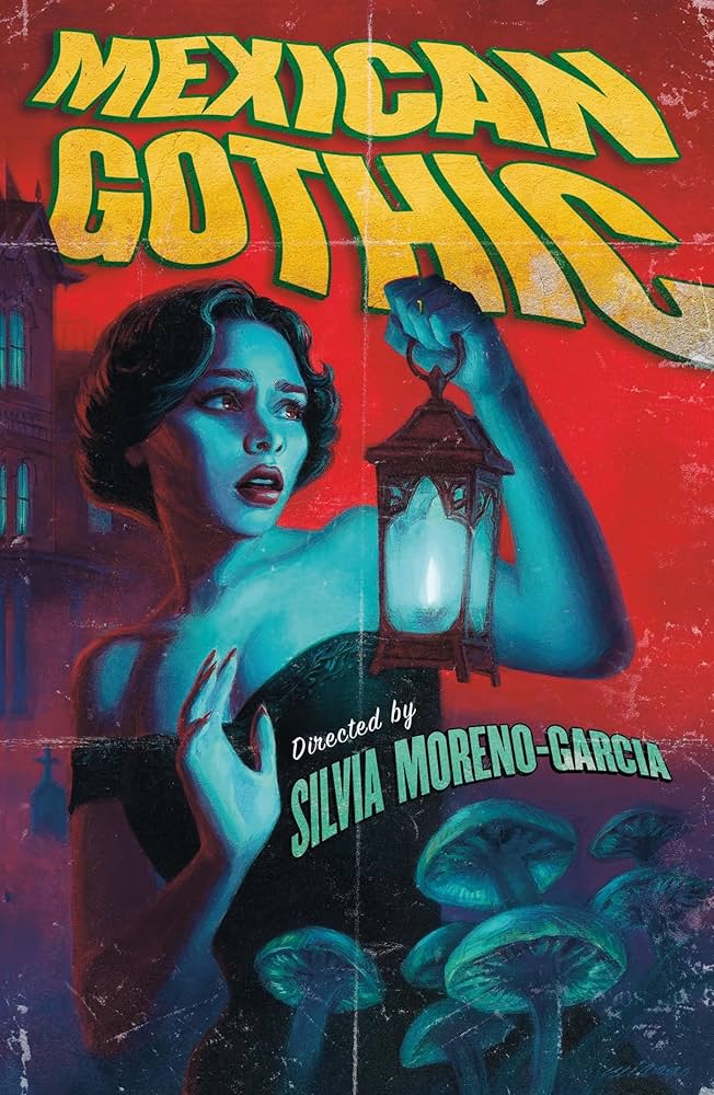
Halloween gives brands permission to play with unease, but for gothic creators and horror storytellers, it is a natural state. Unease creates emotion, and emotion builds connection. It is not about fear for the sake of fear, but about tension, intrigue, and the beauty in imperfection.
Design that feels too safe rarely stays with us. The beauty of unease lies in control, knowing exactly when to let something feel wrong and why. As our founder wrote in Designing with Disharmony, harmony is easy. Unease takes nerve. But when done right, it does not just attract attention, it keeps it.


