Nice content, keep me updated!

When you’re rebranding, you must consider and reflect on all aspects of your brand. This includes everything from your brand goals, what and how you want to communicate, to how you can express that visually. Ideally, teams will work together to ensure all aspects of brand visuals and communications align with the brand values.

Rebranding can be particularly tricky. You aren’t working with a blank piece of paper. You’re working with an entity that exists, and people are attached to. It can be especially difficult to challenge legacy and promote change. You must have solid reasoning, evidence and confidence to ensure your stakeholders stay on board. Which, in all honesty, any successful branding exercise should be based upon.

First, you need to reflect on why you are rebranding. This can be a natural process that happens over time as the company evolves. Or, it may be a sudden change to resolve a public relations issue. So, whether you’re developing your brand or disrupting its legacy, you’re in the right place. This blog will explore the 3 core design decisions you should consider when implementing a rebranding strategy.

Good design takes time

This saying is relevant to any aspect of a rebrand. Good design, good copy, good strategy, good creative. It all takes time, which means enough time to think of ways to differentiate.

Rebranding your business is a big undertaking. One, simply put, you need to get right. There are multiple facets that need to come into consideration, all holding equal value, that, without the right strategy in place, can result in a lacklustre outcome. Although the scale of your rebranding project depends on your business’s scope, we believe there are 3 critical visual aspects to consider when looking at rebranding. Here are our thoughts on them and how we implemented them into our latest rebrand.

1. More than a symbol

The logo is arguably the most identifiable part of any brand; more than merely a symbol of identification, your logo is the cornerstone of everything you do. Great logos are the perfect tools for attracting audiences to your brand, creating memorable impressions, and giving an immediate signal of not just what you do but your tone of voice, intention and market position.
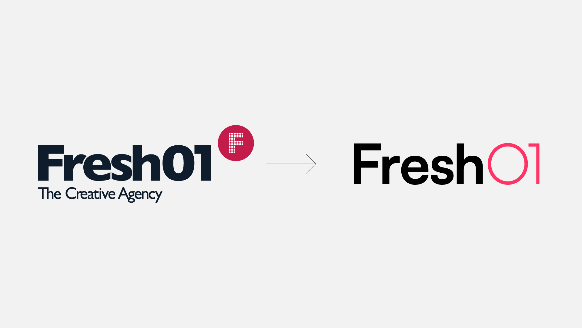
Our new mark is built upon the main principles of our typographic treatments, refined to capture the nuance of our brand. Taking cues from the Swiss Design principles of Müller-Brockmann and Miedinger whilst exaggerating roundness and curves creates a mark that feels approachable and contemporary while rooted in classic design fundamentals.

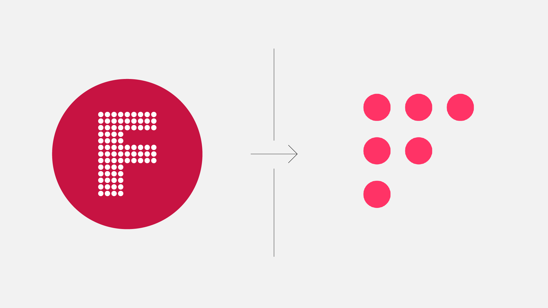
The ‘Dot Mark’ is also a primary indicator for our brand outside of the Wordmark. This mark is minimal, modular and responsive and designed to function across all formats. Developed from Fresh01’s legacy mark, this abstract F form is built to co-exist, being used as an icon or direct indicator of Fresh01’s identity. 

A good logo should be visually captivating and immediately identifiable, accomplishing its branding goals and appealing to its target audience.

2. Stand out with colour

It brings your brand to life; as a brand, you want to cultivate a strong emotional connection with your customers. Used with consideration and balance, colour can communicate clarity and consistency. Vivid highlights and contrasting subtlety turn ordinary into extraordinary, creating or expressing mood or feeling. 
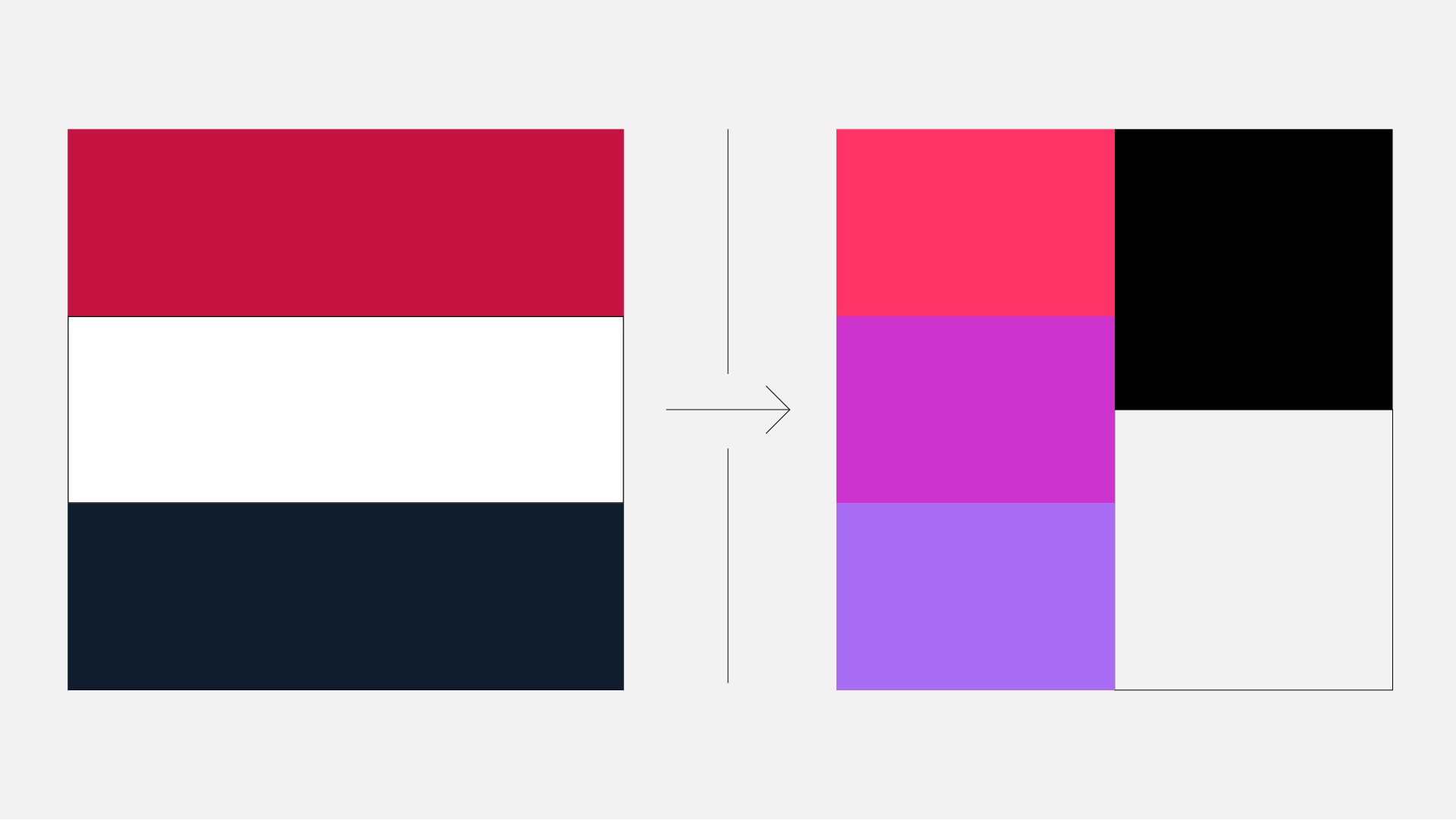
With colour being such a vital part of our brand, it is important to note our primary colour palette has been designed to be the main focus for all communications. Our brand colours are developed through a digital lens, championing high contrast and vibrancy to make a lasting impact. Rich Black and Cultured White are the foundations for our colour theory, with Radical Red being the key brand signifier and Steel Pink and Medium Purple supporting. 

Considering versatility, using gradients in our brand also helps further our brand personality. It can be bold or subtle, the focal point of a design or a background element. The energy conveyed through vibrant colour transitions means this tool should be used sparingly but with intent.

Overall, this palette was developed through a consideration of high impact, going down an unconventional route that allows us to stand out from the crowd and rise above it with vibrant ferocity. 

3. Typography delivers your message

No matter the medium or the audience, type is everywhere that a written message needs to be conveyed. Simply put, typography in design is how your fonts are displayed and how their combination of styling and intention radiates your brand’s personality.
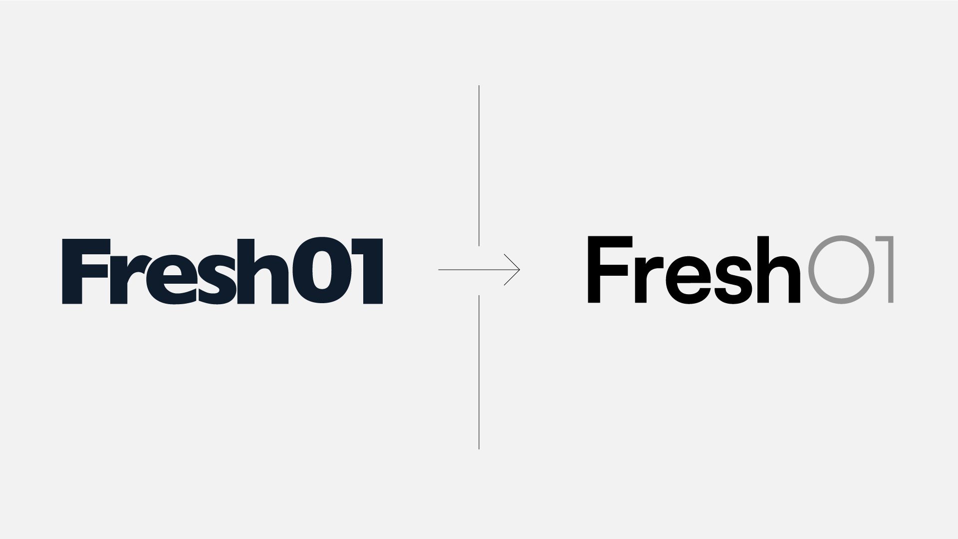
Fresh01’s typographic styling is a powerful tool of expression at that fundamental level of communication, and understanding how our type works enable us to further our unique voice across all visual communication. Built upon the modular design system, our core focus is hierarchy. Utilising 2 distinct typefaces over various weights, Fresh01’s typographic toolkit is designed for flexibility, accessibility and functionality. 

Our Primary Typeface is Satoshi, which combines typically grotesk-style letterforms with some characters that are geometrically designed. In terms of its appearance, Satoshi’s rounded forms create a refined tone of voice that is approachable and design-conscious. Secondary to that is Inter. Widely accessible, this sans-serif typeface designed by Swedish designer/programmer Rasmus Andersson is available in nine weights with matching italics. Primarily to be used in complementary circumstances, its focus on high legibility means this typeface should be used for the body and at a smaller point size.

Using the primary and supporting typefaces harmoniously is built upon understanding hierarchy. The main focus here is contrast; varying type sizes, weights, and styles is critical to defining a clear typographic hierarchy that visually keeps our brand aligned.

Final thoughts

So, we hope that provides insight into how our team approach Fresh01’s rebrand. It’s safe to say rebranding is a massive undertaking for any size business. But, in many cases, it is a worthwhile exercise that increases morale and allows your brand to grow.

There are many parts to consider and implement to roll out a new brand successfully, but we cover these in our other blogs.

If you need help with your brand guidelines, try this blog:

Are you looking to get your brand on social media? Here’s the blog for you: What is the importance of graphic design in social media?

Are you thinking about a brand refresh? We have some things to consider: Do I need a brand refresh?
Nice content, keep me updated!

Keep Reading…