
Magazines need to communicate with their target audience before the content is even read. Through typography, colour, layout, and imagery, editorial design creates an identity that attracts the right audience while subtly pushing away the wrong one.
Nowhere is this more important than on the cover. In a shop aisle filled with competing publications, a magazine has only a few seconds to catch someone’s attention. The cover needs to stand out visually, but it also needs to signal immediately who the magazine is for. A successful cover is not designed to appeal to everyone. It is designed to stop the right person.
A strong example of this can be seen when comparing modern alternative music magazines with older rock publications. The recent Rock Sound cover featuring The Warning feels sleek, stylised, and highly art directed. The bold red background immediately catches the eye in an aisle, but the composition itself is surprisingly controlled. There is far more negative space than many traditional rock magazines would use, allowing the photography to dominate the page.
The styling, lighting, and restrained typography position the band almost like fashion icons, blending alternative music culture with a cleaner, more modern visual identity. Even the gothic-inspired typography used for The Warning’s logo feels carefully balanced rather than chaotic. The design reflects the audience the magazine is targeting, younger readers who often overlap with online fashion culture, social media aesthetics, and contemporary alternative music scenes.

Compare that to the October 15th 2005 Kerrang! issue centred around Kurt Cobain and Nirvana. The approach could not be more different. Every inch of the cover is filled. Headlines overlap one another, sidebars fight for space, colours clash aggressively, and typography is layered almost chaotically across the page. Even the “Kerrang is Loud” slogan reinforces the publication’s identity visually and emotionally.
Where the Rock Sound cover feels curated and cinematic, the Kerrang! issue feels raw and intense. That lack of restraint is intentional. It reflects the rebellious energy associated with rock and metal culture during that era. The design does not aim for elegance. It aims for impact.
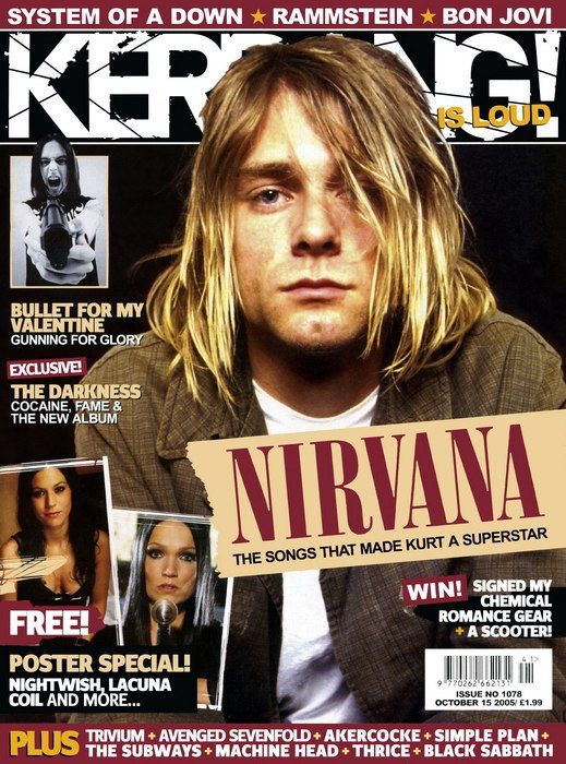
Kerrang! Issue No. 1078 featuring Kurt Cobain and Nirvana. © Kerrang! Magazine / Wasted Talent Ltd. Used for editorial commentary and design analysis.
That contrast alone shows how editorial design evolves alongside both audience and culture. Modern alternative magazines often blend music culture with fashion and lifestyle aesthetics, while older rock publications leaned into visual noise and aggression to mirror the scenes they represented. Both covers are trying to achieve the same thing, standing out instantly to the right audience, but they do it in completely different ways.
Music magazines aimed at broader audiences take another route entirely. Rolling Stone often treats artists more like cultural icons than underground figures. Covers typically rely on cinematic portrait photography, cleaner layouts, and more restrained typography, while still holding onto the vintage aesthetic the magazine has carried since its early years. The signature beige border and sharp pops of red typography create an instantly recognisable identity that feels timeless rather than trend-driven. The result appeals not only to music fans, but also to readers interested in wider culture, celebrity, and storytelling.
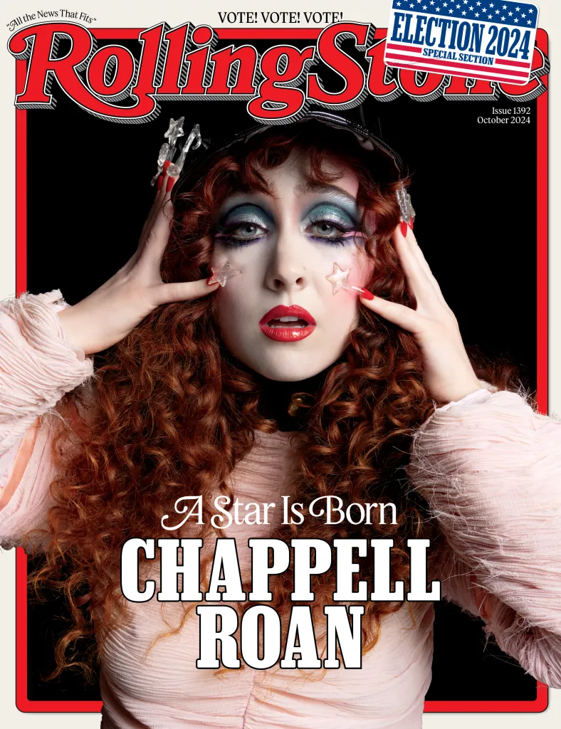
Rolling Stone magazine cover imagery. © Rolling Stone / Penske Media Corporation. Used for editorial commentary and design analysis.
Lifestyle magazines build identity through completely different visual cues. Publications such as Vogue use spacious layouts, elegant typography, and carefully balanced imagery to create a sense of luxury and aspiration. One of Vogue’s most recognisable design choices is how frequently the celebrity on the cover overlaps or partially obscures the magazine’s logo. The masthead is so iconic that it remains recognisable even when hidden, while also reinforcing the idea that the featured celebrity is powerful enough to become the focal point of the entire cover.
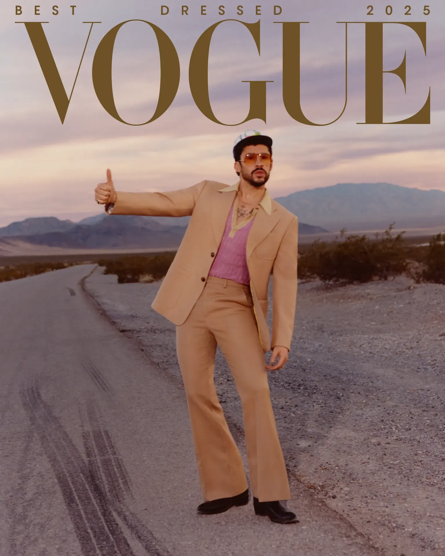
Vogue magazine cover imagery. © Vogue / Condé Nast. Used for editorial commentary and design analysis.
Meanwhile, Men’s Health leans into bold sans serifs, strong contrast, and direct cover lines that communicate motivation, energy, and self-improvement before the magazine is even opened.
Children’s magazines rely on another visual language altogether. Bright primary colours, oversized typography, busy compositions, and recognisable characters are all designed to grab attention instantly. Their covers are intentionally loud and playful because they are competing for attention in a much faster, more immediate way.
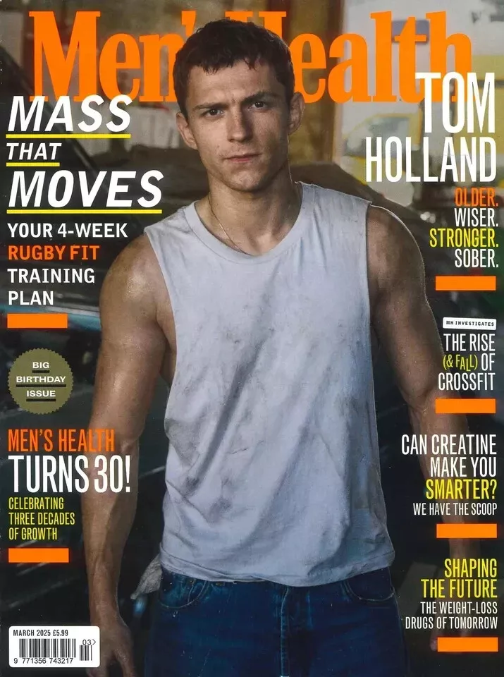
Men’s Health magazine cover imagery. © Men’s Health / Hearst Communications. Used for editorial commentary and design analysis.
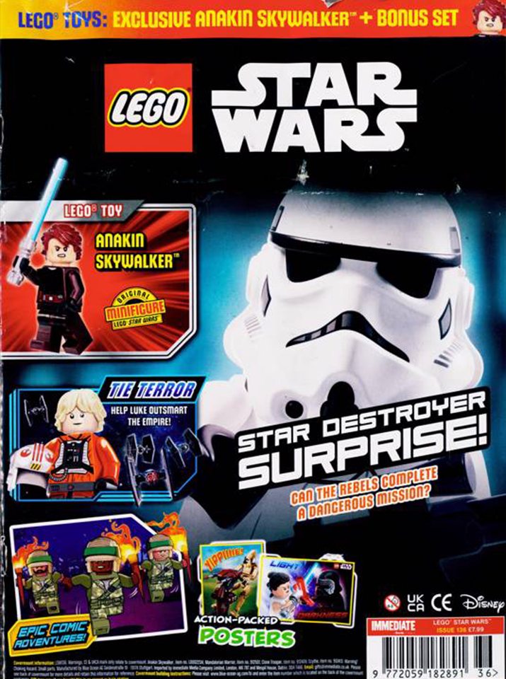
LEGO magazine cover imagery. © The LEGO Group. Used for editorial commentary and design analysis.
What makes editorial design so effective is how intentional these decisions are. Fonts, spacing, photography, and colour palettes are chosen not just for aesthetics, but for recognition and belonging. Readers want to feel understood by the media they engage with, and visual identity is often the first thing that creates that connection.
The best magazine covers do more than sell an issue. They create a world around the audience they are speaking to, making someone feel like they belong before they even turn the first page.