At Fresh01, some of the most rewarding projects aren’t about creating something entirely new. They’re about helping a great brand grow intelligently.
DogFest is already a much-loved national event with a strong visual identity and loyal audience. When the team asked us to develop a series of sub-brand logos spanning multiple themes and locations, the task wasn’t reinvention. It was system-building.
From countryside landscapes to festive winter editions, we needed to create a flexible identity framework that could expand without losing consistency.
One Brand, Multiple Experiences
The growing DogFest portfolio now includes:


Each event has its own personality, seasonality and setting, yet they all need to feel unmistakably part of the same family. That balance between individuality and cohesion was at the heart of our approach.
Protecting the Core Identity
The DogFest wordmark carries strong recognition and warmth. Its bold curves and confident weight immediately communicate friendliness and accessibility, qualities central to the brand.
So we established clear non-negotiables:
- The core DogFest lettering
- The organic base shape device
- Layered silhouette backdrops
- A handwritten or expressive secondary script for sub-lines
- Consistent sponsor lock-up positioning
By locking these structural elements in place, we created a reliable framework that could flex without fragmenting.
Designing Through Silhouette and Setting
Rather than introducing highly detailed illustrations for each sub-brand, we leaned into simplified, tonal silhouettes. This ensured scalability, clarity and ease of production across digital, print, signage and merchandise.
Each variation uses setting as the storytelling device:
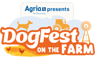
- On the Farm introduces windmills, barns and warm harvest tones.
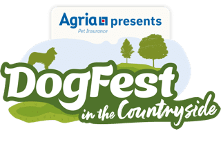
- In the Countryside uses rolling hills and tree lines in layered greens.
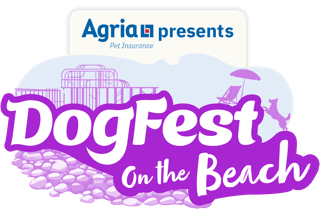
- On the Beach adopts lighter, playful coastal elements and brighter tones.
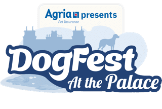
- At the Palace elevates the tone with architectural silhouettes and a refined British blue palette inspired by heritage surroundings.
The consistent use of layered background shapes allows each logo to feel dimensional without becoming overly complex.


Colour as a System
Colour played a critical role in differentiating each event while maintaining visual harmony.
We treated each sub-brand as a chapter within the same story, adjusting palettes to reflect season, mood and setting while keeping tonal depth and contrast consistent across the suite.
The result is a recognisable DogFest aesthetic that adapts effortlessly, whether it’s vibrant summer energy, festive winter warmth, or stately heritage refinement.

Designed for Real-World Application
These logos don’t just live online. They appear on:
- Large-scale event signage
- Merchandise and apparel
- Social assets
- Sponsor materials
- Wayfinding systems
- Environmental branding
That meant every design needed to be:
- Legible at distance
- Reproducible in flat colour
- Balanced with sponsor lock-ups
- Adaptable across varying formats
Restraint was essential. Strong shapes over fine detail. Clear hierarchy over decoration.

A Scalable Identity for the Future
What began as individual logo commissions has evolved into a cohesive identity system. New locations and themed editions can now be introduced simply by evolving silhouette, palette and supporting elements, all within an established structure.
That’s the power of considered brand architecture.
Final Thoughts
The DogFest portfolio demonstrates how thoughtful design can allow a brand to expand without losing clarity. Each event feels distinctive, yet part of something bigger.
At Fresh01, we believe branding should grow with purpose, building systems that support ambition rather than restrict it.
If your brand is expanding and needs structure without losing personality, we’d love to help. Let’s talk.