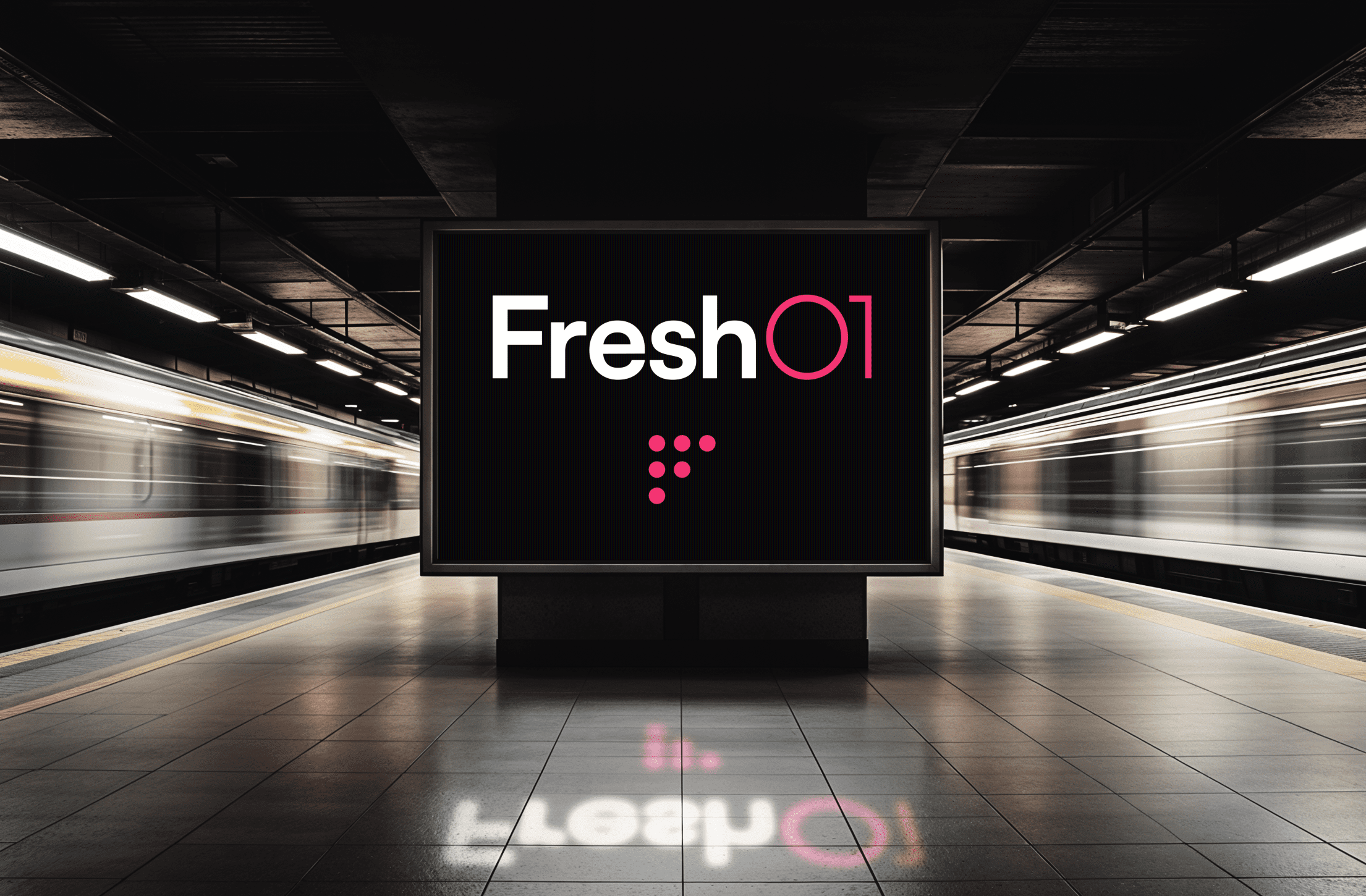

Typography is a cornerstone of branding. It’s more than just a stylistic choice; it’s a strategic tool that can communicate a brand’s essence at a glance. The power of typography in branding lies in its ability to convey personality, create emotional connections, and ensure consistency across all platforms.
Every typeface has its own voice and character. A bold, modern font can communicate strength and innovation, while a script font might suggest elegance and tradition. Choosing the right typography is crucial because it sets the tone for how a brand is perceived. For example, a tech startup might use clean, sans-serif fonts to convey a sense of modernity and simplicity, while a luxury brand might opt for a classic serif font to evoke a sense of timelessness and sophistication.

Typography also plays a critical role in brand recognition. Think about the world’s most iconic brands—Coca-Cola, Disney, and Google, to name a few. Each of these brands uses a unique typeface that is instantly recognisable, even without the company name attached. This shows how powerful typography can be in making a brand memorable.
Moreover, typography ensures consistency across all branding materials. From business cards and brochures to websites and social media, a consistent typographic style helps reinforce a brand’s identity. This consistency builds trust with customers, as it shows that the brand is reliable and cohesive.
In essence, the correct use of typography in branding is about more than aesthetics; it’s about creating a cohesive and compelling visual identity that resonates with the target audience.