In music, typography often speaks before the sound does. Fonts don’t just decorate; they tell a story, set a mood, and hint at what’s coming. While it’s easy to assume bold fonts equal heavy music and clean fonts mean pop, the truth is more layered. Often, it’s not just about genre; it’s about theme.
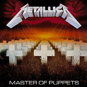
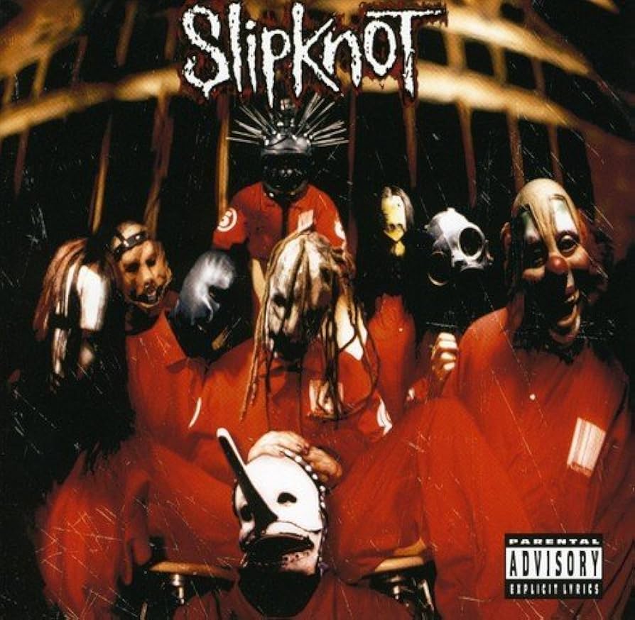
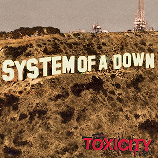
Let’s start with the obvious. Bold, aggressive fonts are staples of heavy music. They immediately communicate power, volume, and attitude. Think of Metallica’s sharp, iconic lettering, Slipknot’s chaotic, scrawled logo, or System of a Down’s blocky, all-caps font that resembles protest posters. These choices align perfectly with the sound and energy of the music.
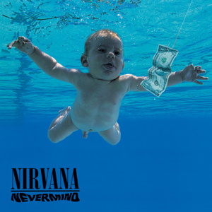
Then you have albums like Nirvana’s Nevermind, which takes a minimalist approach. The font is plain, unobtrusive, and almost indifferent, it mirrors the stripped-back, raw honesty of grunge itself. It doesn’t scream, but it says enough.
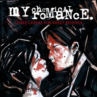
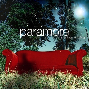
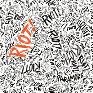
Pop-punk and emo often lean into handwritten or distressed fonts. My Chemical Romance’s Three Cheers for Sweet Revenge uses Victorian gothic lettering that perfectly matches its theatrical, macabre themes. Paramore’s early work used sharp sans-serifs with splatter and grunge effects to reflect emotional tension.
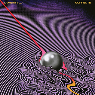
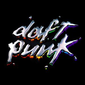
Electronic and indie acts tend to go more minimalist and stylized. Think Tame Impala’s Currents, with its clean, scientific type paired against surreal visuals, balancing chaos and control. Or Daft Punk’s Discovery, where the chrome, futuristic type immediately signals retro-futurism and high concept.
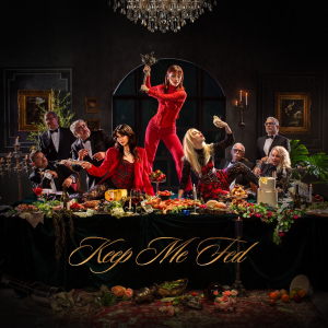
But sometimes fonts break genre expectations completely. The Warning’s Keep Me Fed, a heavy rock album, features ornate, gilded cursive, something you’d expect on a luxury perfume box, not a rock record. But it fits. The theme is decadence, power imbalance, and rebellion. The font mocks wealth and elegance, playing into the album’s “eat the rich” attitude.
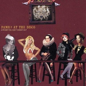
A prime example of fonts working in line with the theme comes from Panic! At The Disco’s A Fever You Can’t Sweat Out. The album’s gothic, Victorian-style font matches perfectly with the theatrical, almost carnival-like theme behind the album. Emo and pop-punk bands often use grunge or distressed fonts (as mentioned above), but Panic! At The Disco went a step further by embracing Victorian elegance, adding an element of high drama that aligns with the band’s theatrical performance style. The font creates a sense of dark elegance, making the music feel more like a grand, emotional show than a simple punk album.
Concert posters play into this too. A doom metal gig might feature illegible blackletter, while a synthwave night could use pixel fonts or neon cursives. The genre gives you a blueprint, but the theme builds the house.
Typography in music is more than just genre matching. It’s emotional architecture. And when it’s done right, the font becomes part of the sound.
In music, typography often speaks before the sound does. Fonts don’t just decorate; they tell a story, set a mood, and hint at what’s coming. While it’s easy to assume bold fonts equal heavy music and clean fonts mean pop, the truth is more layered. Often, it’s not just about genre; it’s about theme.
Let’s start with the obvious. Bold, aggressive fonts are staples of heavy music. They immediately communicate power, volume, and attitude. Think of Metallica’s sharp, iconic lettering, Slipknot’s chaotic, scrawled logo, or System of a Down’s blocky, all-caps font that resembles protest posters. These choices align perfectly with the sound and energy of the music.


Then you have albums like Nirvana’s Nevermind, which takes a minimalist approach. The font is plain, unobtrusive, and almost indifferent, it mirrors the stripped-back, raw honesty of grunge itself. It doesn’t scream, but it says enough.

Pop-punk and emo often lean into handwritten or distressed fonts. My Chemical Romance’s Three Cheers for Sweet Revenge uses Victorian gothic lettering that perfectly matches its theatrical, macabre themes. Paramore’s early work used sharp sans-serifs with splatter and grunge effects to reflect emotional tension.


Electronic and indie acts tend to go more minimalist and stylized. Think Tame Impala’s Currents, with its clean, scientific type paired against surreal visuals, balancing chaos and control. Or Daft Punk’s Discovery, where the chrome, futuristic type immediately signals retro-futurism and high concept.


But sometimes fonts break genre expectations completely. The Warning’s Keep Me Fed, a heavy rock album, features ornate, gilded cursive, something you’d expect on a luxury perfume box, not a rock record. But it fits. The theme is decadence, power imbalance, and rebellion. The font mocks wealth and elegance, playing into the album’s “eat the rich” attitude.

A prime example of fonts working in line with the theme comes from Panic! At The Disco’s A Fever You Can’t Sweat Out. The album’s gothic, Victorian-style font matches perfectly with the theatrical, almost carnival-like theme behind the album. Emo and pop-punk bands often use grunge or distressed fonts (as mentioned above), but Panic! At The Disco went a step further by embracing Victorian elegance, adding an element of high drama that aligns with the band’s theatrical performance style. The font creates a sense of dark elegance, making the music feel more like a grand, emotional show than a simple punk album.

Concert posters play into this too. A doom metal gig might feature illegible blackletter, while a synthwave night could use pixel fonts or neon cursives. The genre gives you a blueprint, but the theme builds the house.
Typography in music is more than just genre matching. It’s emotional architecture. And when it’s done right, the font becomes part of the sound.


