Nice content, keep me updated!

In the digital age, typography is more than just selecting a pretty font; it is about creating an experience. The web is a visual medium, and the typefaces chosen for websites can significantly impact how content is perceived and understood. Correct typography on the web does more than just decorate a page; it guides the reader through the content, emphasises critical messages, and establishes a brand’s tone.

When it comes to web design, readability is paramount. The font size, line spacing, and even the choice between serif and sans-serif can influence how easily a visitor can consume the content. For example, sans-serif fonts are often used for digital interfaces because they are typically more legible on screens. However, the context matters; a serif font might convey a more formal or academic tone, which could be beneficial depending on the brand and the message.
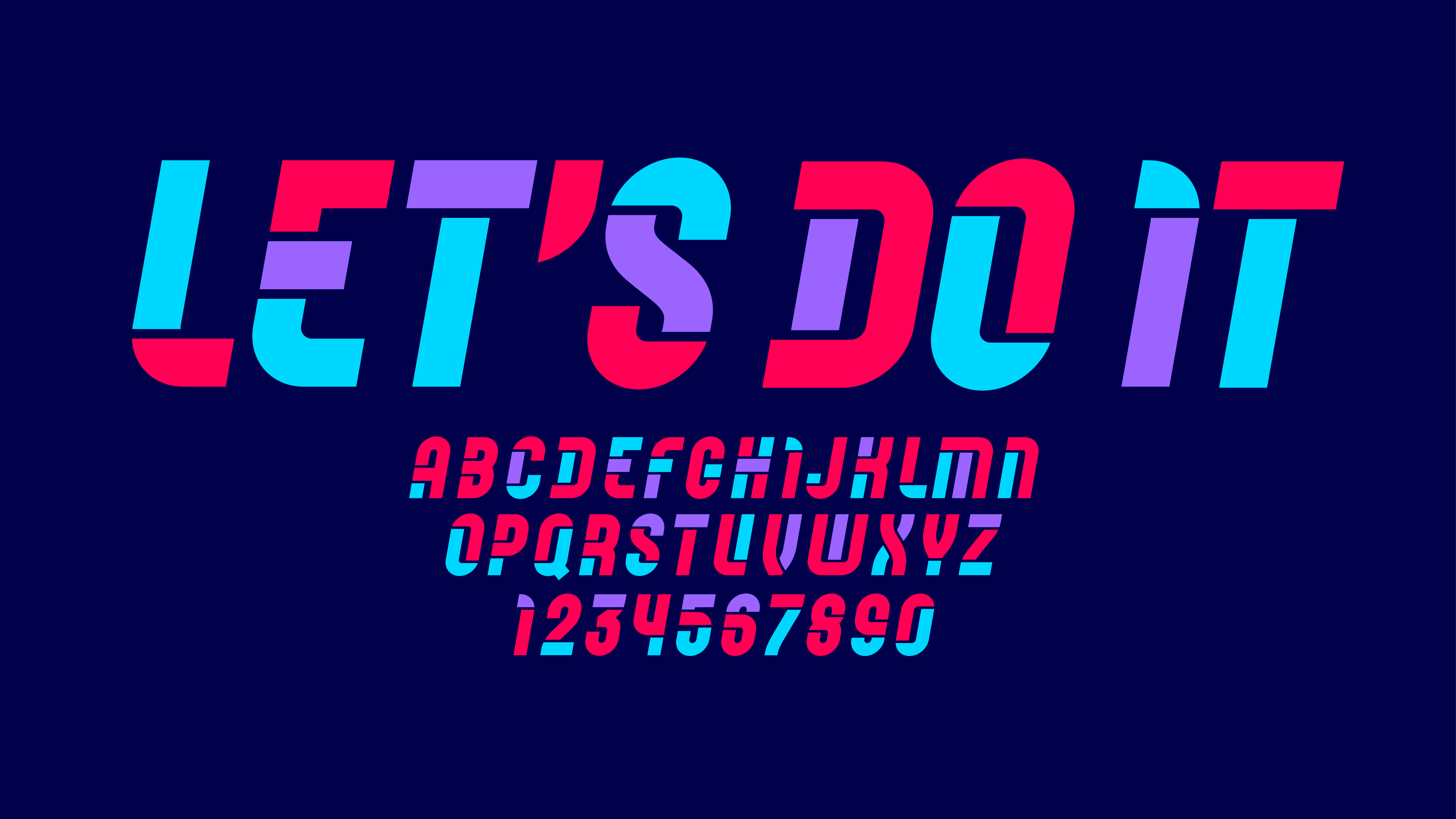
The right use of typography also impacts accessibility. Fonts need to be clear and readable for all users, including those with visual impairments. The correct choice of type can make a website more inclusive, ensuring that content is accessible to everyone.

Moreover, typography contributes to a website’s hierarchy. Through size, weight, and spacing, different typographic elements can create a visual structure that leads the reader’s eye to the most important information first. This not only enhances user experience but also ensures that the most critical messages are noticed.

In an era where users often decide within seconds whether to stay on a webpage, effective typography can be a powerful tool to keep them engaged. It conveys professionalism, builds trust, and communicates the brand’s personality.

Nice content, keep me updated!

Keep Reading…