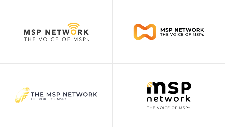
When MSP Network first launched, they had an initial logo to get things off the ground. However, as the company began to take shape, it became clear that the original design didn’t quite capture their vision. They needed a new logo—something modern, professional, and scalable—that would better represent who they are and where they’re headed.
The Need for a New Logo
As a growing company in the managed services space, MSP Network wanted a brand identity that felt polished and intentional. The first logo, while functional, didn’t align with their long-term vision. It lacked the versatility needed for different platforms and didn’t fully convey their core themes of technology, connectivity, and innovation.
The Design Process: Finding the Right Direction
Our approach started with identifying the key elements MSP Network wanted to express:
- Connectivity – Representing their role in linking businesses, technology, and service providers.
- Modern & Professional – A clean, sleek design that feels both trustworthy and forward-thinking.
- Scalability – A logo that works well across websites, social media, presentations, and marketing materials.
From there, we explored various concepts, refining shapes, colors, and typography to strike the right balance between boldness and simplicity.

The Final Logo: A Stronger Visual Identity
After multiple iterations, we landed on the new design (seen in the second image). This updated logo embraces a fresh, professional look with refined typography and a more dynamic icon. The new color scheme adds impact and versatility, making it easier to use across different media.
With this new branding, MSP Network now has a logo that truly represents its mission and sets a strong foundation for future growth.
This is just the beginning, and we’re excited to see how the brand continues to evolve!

When MSP Network first launched, they had an initial logo to get things off the ground. However, as the company began to take shape, it became clear that the original design didn’t quite capture their vision. They needed a new logo—something modern, professional, and scalable—that would better represent who they are and where they’re headed.
The Need for a New Logo
As a growing company in the managed services space, MSP Network wanted a brand identity that felt polished and intentional. The first logo, while functional, didn’t align with their long-term vision. It lacked the versatility needed for different platforms and didn’t fully convey their core themes of technology, connectivity, and innovation.
The Design Process: Finding the Right Direction
Our approach started with identifying the key elements MSP Network wanted to express:
- Connectivity – Representing their role in linking businesses, technology, and service providers.
- Modern & Professional – A clean, sleek design that feels both trustworthy and forward-thinking.
- Scalability – A logo that works well across websites, social media, presentations, and marketing materials.
From there, we explored various concepts, refining shapes, colors, and typography to strike the right balance between boldness and simplicity.

The Final Logo: A Stronger Visual Identity
After multiple iterations, we landed on the new design (seen in the second image). This updated logo embraces a fresh, professional look with refined typography and a more dynamic icon. The new color scheme adds impact and versatility, making it easier to use across different media.
With this new branding, MSP Network now has a logo that truly represents its mission and sets a strong foundation for future growth.
This is just the beginning, and we’re excited to see how the brand continues to evolve!


