Movie posters are often our first glimpse into a film’s world. They don’t just sell tickets. They set the tone, hint at the story, and stir emotion before the first frame. But good poster design is tricky. It needs to balance clarity with mystery, storytelling with style, and impact with restraint. What works? What falls flat? Let’s dive in.
A major trend that dominated in recent years is the “floating heads” style. Arrays of character close-ups arranged neatly across the poster. Marvel Studios made this famous with their early Avengers campaigns. It was fresh, exciting, and gave audiences a clear look at the ensemble cast. But now this formula is everywhere. Films like Dune have adopted it, but the effect feels tired, lacking the punch it once had. The main goal of these posters has shifted from highlighting the story or mood to using the actors themselves as the primary advertisement. This actor-centric approach can overshadow the film’s unique content, making posters feel generic and less engaging.


That said, Marvel has started to venture out more with some of their recent posters, especially for Thunderbolts*. These new designs break away from the traditional floating heads by embracing more thematic and dynamic compositions that hint at the story and tone rather than just the cast. This shift shows how even big studios are looking to evolve poster design to be more visually interesting and narratively rich.

Great posters, by contrast, master framing and colour to foreshadow story and mood. Take Jaws. The vast blue ocean dominates the frame with the tiny swimmer above and the enormous shark beneath. The stark contrast between the peaceful surface and lurking danger below perfectly sets the suspense. The framing creates tension and directs your eye right to the threat, while the colour palette, blues and reds, heightens the feeling of danger and blood.

Stanley Kubrick’s 2001: A Space Odyssey poster features a striking composition with a large planet positioned on the left side and a space station near the top of the frame. The use of bold yellow text at the bottom contrasts vividly against the darker background, immediately drawing attention to the title. This layout not only grounds the poster firmly in the sci-fi genre but also foreshadows the film’s themes of space exploration and the unknown. The framing and color choices create a sense of vastness and mystery, inviting viewers to step into the epic journey that the movie promises.

In the realm of graphic design, Saul Bass is the gold standard. His posters use bold, simple shapes and colours to symbolise deeper themes. For example, his work for Vertigo uses spirals to visually represent the psychological thriller’s obsession and dizziness. These posters prove that clever abstraction, when well framed, can be more powerful than cluttered imagery.

Repo! The Genetic Opera uses a bold and striking poster featuring the central red-costumed character framed prominently, with the title text in vivid yellow and red set at a dynamic angle. This graphic and stylised approach perfectly captures the film’s edgy, cult aesthetic while drawing immediate attention. The intense colors and strong composition communicate the movie’s dark, theatrical tone and help it stand out in a sea of more conventional posters.

Ultimately, the best movie posters carefully consider framing, colour, typography, and visual storytelling. They don’t just showcase the cast or the title. They hint at tone, build anticipation, and stay memorable. As Hollywood continues to churn out blockbuster after blockbuster, the posters that stand out will be the ones that dare to do less but say more.
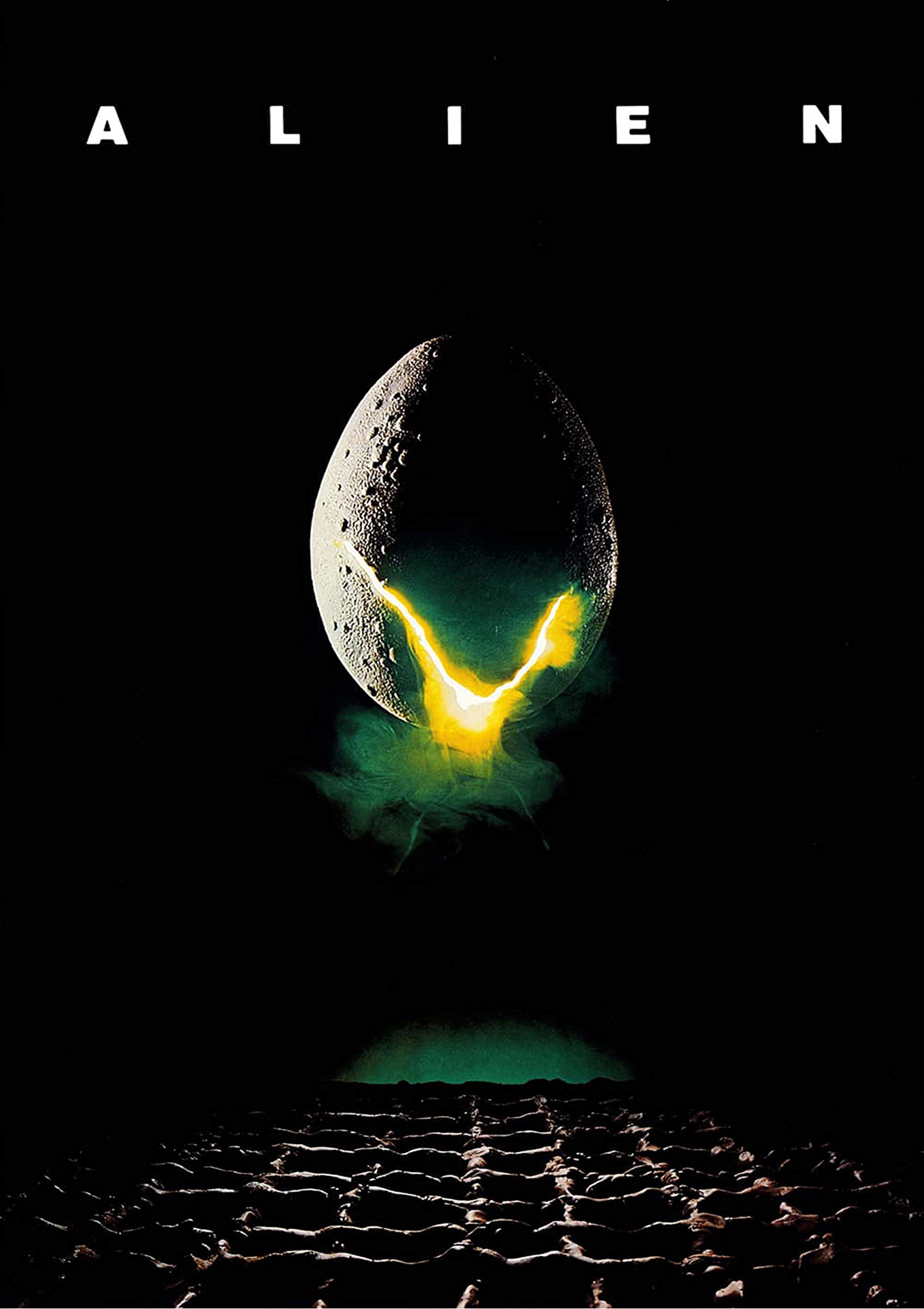
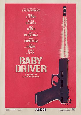
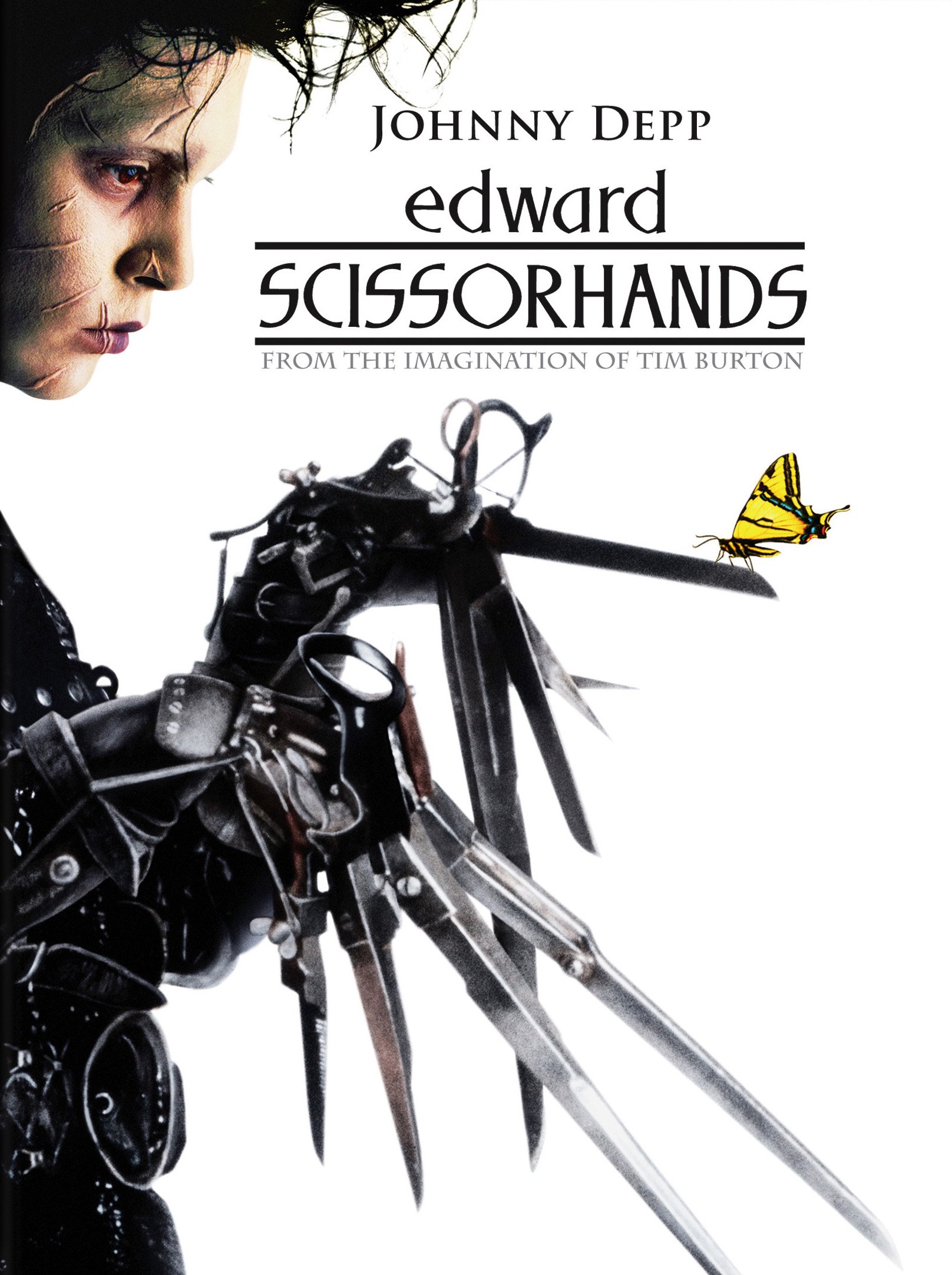
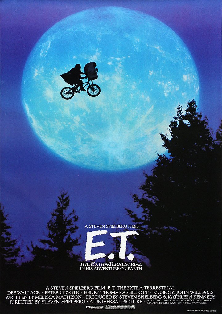
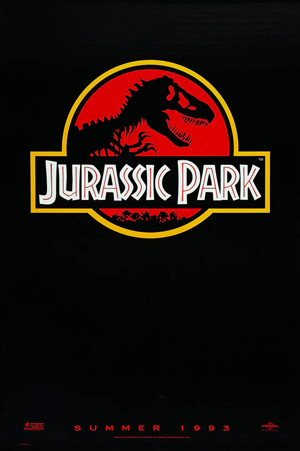
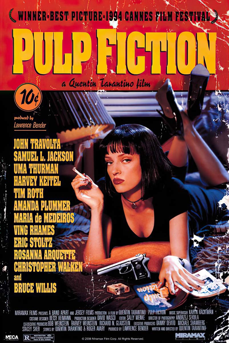
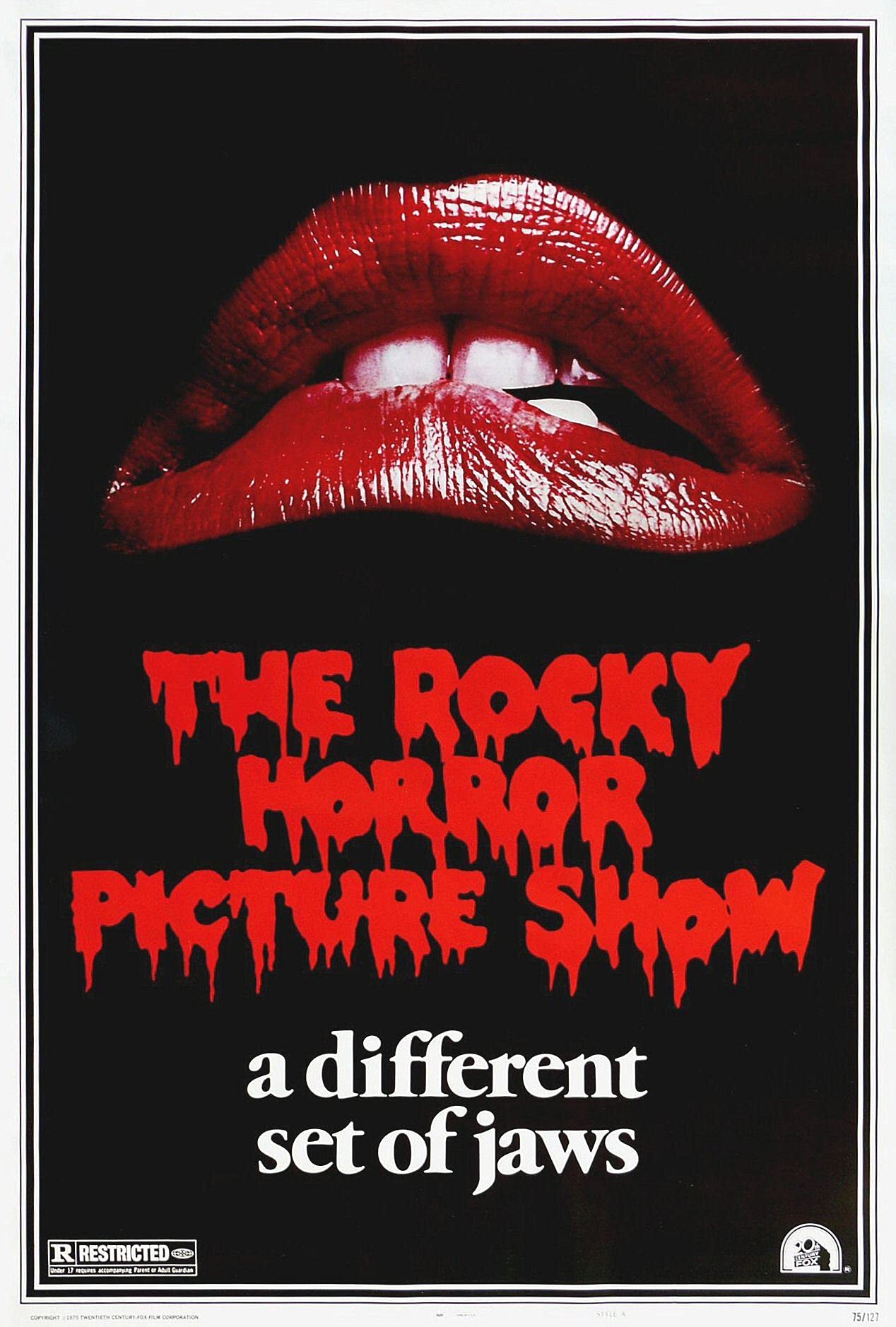
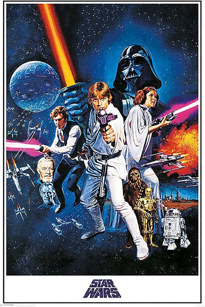
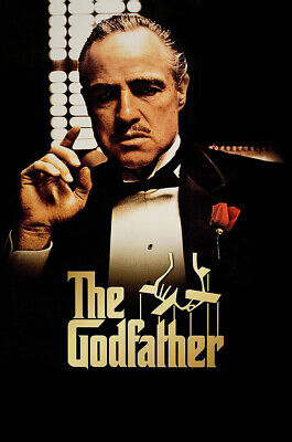
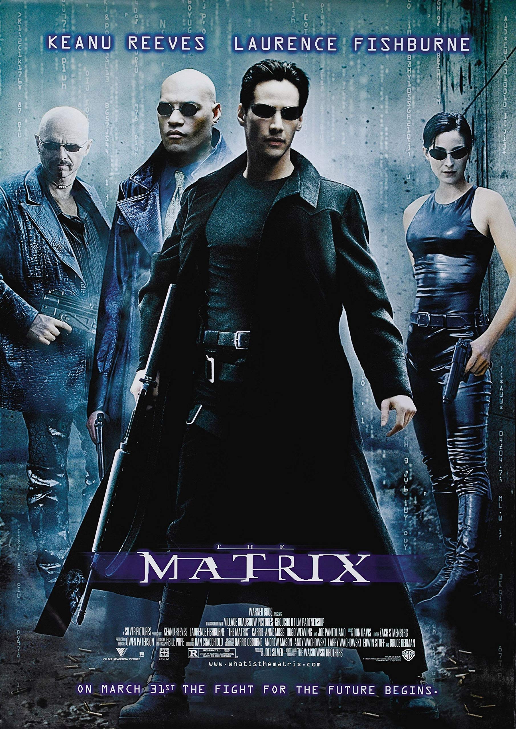
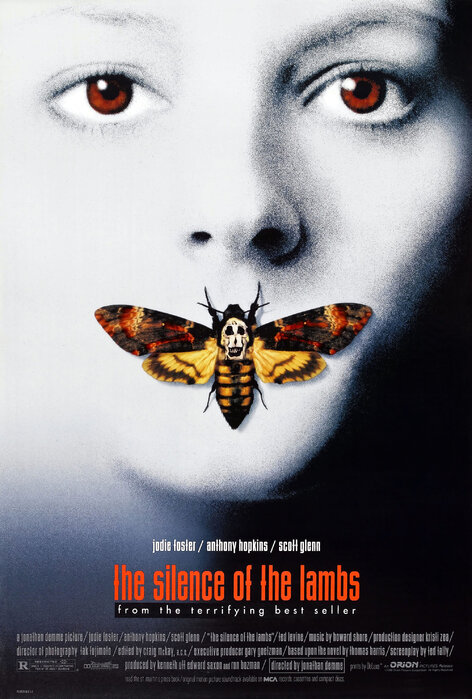
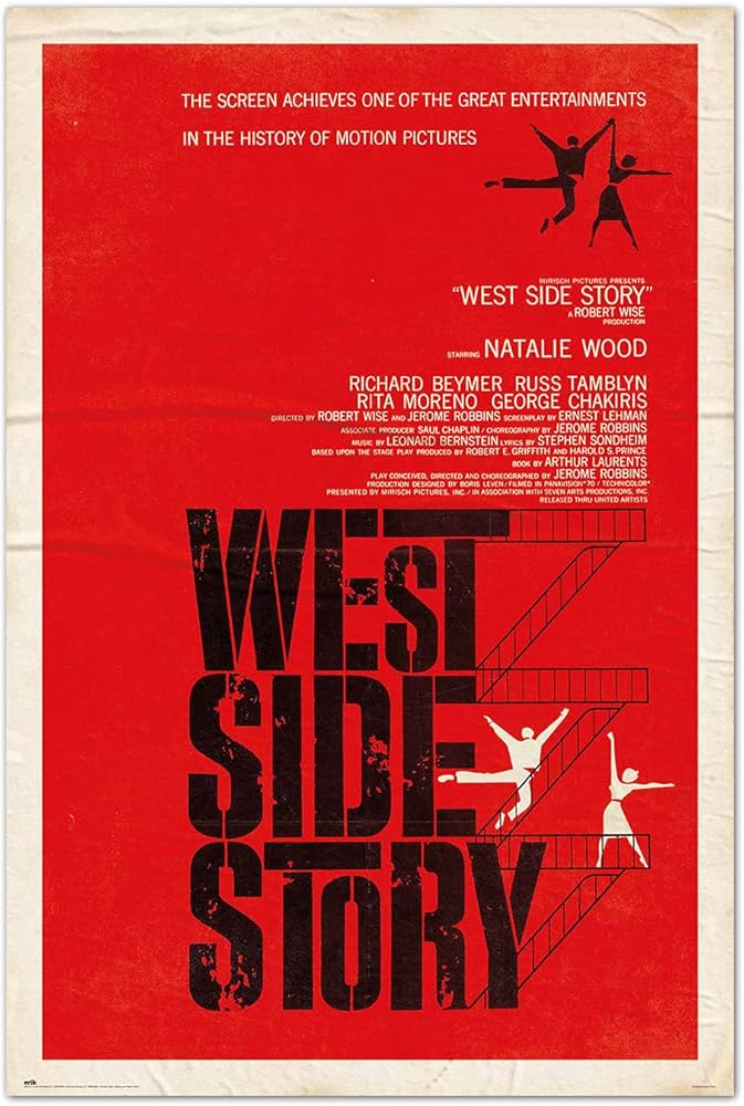
Honourable mentions:

Movie posters are often our first glimpse into a film’s world. They don’t just sell tickets. They set the tone, hint at the story, and stir emotion before the first frame. But good poster design is tricky. It needs to balance clarity with mystery, storytelling with style, and impact with restraint. What works? What falls flat? Let’s dive in.
A major trend that dominated in recent years is the “floating heads” style. Arrays of character close-ups arranged neatly across the poster. Marvel Studios made this famous with their early Avengers campaigns. It was fresh, exciting, and gave audiences a clear look at the ensemble cast. But now this formula is everywhere. Films like Dune have adopted it, but the effect feels tired, lacking the punch it once had. The main goal of these posters has shifted from highlighting the story or mood to using the actors themselves as the primary advertisement. This actor-centric approach can overshadow the film’s unique content, making posters feel generic and less engaging.
That said, Marvel has started to venture out more with some of their recent posters, especially for Thunderbolts*. These new designs break away from the traditional floating heads by embracing more thematic and dynamic compositions that hint at the story and tone rather than just the cast. This shift shows how even big studios are looking to evolve poster design to be more visually interesting and narratively rich.
Great posters, by contrast, master framing and colour to foreshadow story and mood. Take Jaws. The vast blue ocean dominates the frame with the tiny swimmer above and the enormous shark beneath. The stark contrast between the peaceful surface and lurking danger below perfectly sets the suspense. The framing creates tension and directs your eye right to the threat, while the colour palette, blues and reds, heightens the feeling of danger and blood.
Stanley Kubrick’s 2001: A Space Odyssey poster features a striking composition with a large planet positioned on the left side and a space station near the top of the frame. The use of bold yellow text at the bottom contrasts vividly against the darker background, immediately drawing attention to the title. This layout not only grounds the poster firmly in the sci-fi genre but also foreshadows the film’s themes of space exploration and the unknown. The framing and color choices create a sense of vastness and mystery, inviting viewers to step into the epic journey that the movie promises.
In the realm of graphic design, Saul Bass is the gold standard. His posters use bold, simple shapes and colours to symbolise deeper themes. For example, his work for Vertigo uses spirals to visually represent the psychological thriller’s obsession and dizziness. These posters prove that clever abstraction, when well framed, can be more powerful than cluttered imagery.
Repo! The Genetic Opera uses a bold and striking poster featuring the central red-costumed character framed prominently, with the title text in vivid yellow and red set at a dynamic angle. This graphic and stylised approach perfectly captures the film’s edgy, cult aesthetic while drawing immediate attention. The intense colors and strong composition communicate the movie’s dark, theatrical tone and help it stand out in a sea of more conventional posters.
Ultimately, the best movie posters carefully consider framing, colour, typography, and visual storytelling. They don’t just showcase the cast or the title. They hint at tone, build anticipation, and stay memorable. As Hollywood continues to churn out blockbuster after blockbuster, the posters that stand out will be the ones that dare to do less but say more.
Honourable mentions: