At Fresh01, we thrive on opportunities to partner with forward-thinking organisations who are shaping the future through technology. Our long-standing relationship with the Wireless Broadband Alliance (WBA) has already seen us deliver branding and digital solutions for their main organisation and global events. So when they launched their new commercial arm, WBA Services, we were excited to step in and bring this entity to life through strategic, considered design.
WBA Services was established to launch and manage the Wireless Broadband Alliance’s Automated Frequency Coordination (AFC) platform, a commercial service enabling standard power Wi-Fi in the 6 GHz band. It’s a major technical leap, and our role was to translate that innovation into a clear, confident brand identity and marketing platform.
A Distinct Identity Within a Global Brand
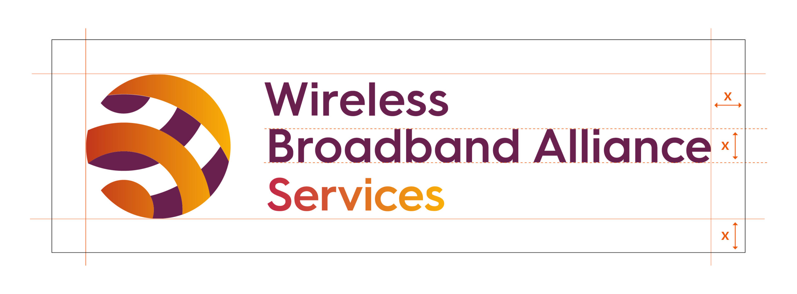
Our brief was twofold: create a visual identity that maintains the credibility of the WBA brand, while distinguishing WBA Services as a commercial entity with a focused offering. The logo was the first, and most crucial, step in this evolution.
We began with the existing WBA wordmark and globe device, symbols of established global connectivity, and built on them to communicate WBA Services’ new focus on delivery, agility and commercial scale. A key part of that transformation came through colour.
To set WBA Services apart visually while staying connected to the parent brand, we developed a bold new colour scheme built around three key tones:
-
Maple Red – This rich, grounded red brings a sense of authority and dependability. It subtly connects back to WBA’s established trust and leadership in the wireless industry, while introducing a more grounded, purposeful tone suited to the Services brand.
-
Signal Orange – A vibrant, high-energy hue drawing immediate attention and suggests agility, innovation, and forward momentum, perfect for a brand driving high-impact technology adoption.
-
The Gradient Transition – Perhaps the most distinctive feature, this smooth gradient between orange and maple red provides more than visual flair. It serves as a subtle metaphor for spectrum coordination, the fluid transition of power levels and frequencies the AFC platform manages in real time.
This colour story does more than decorate. It conveys purpose, positioning WBA Services as a trusted yet dynamic force in wireless infrastructure, capable of supporting everything from smart cities to enterprise networks and Wi-Fi 7 deployments.
By combining warmth with confidence, we ensured the brand palette not only looks beautiful across web and print, but also reinforces the message at every touchpoint: this is innovation with intent.
Building a Seamless Digital Platform
With the visual identity established, we moved on to creating a dedicated digital platform for WBA Services. Our objective was to communicate complex technical information in a way that was accessible, clean, and confidently commercial.
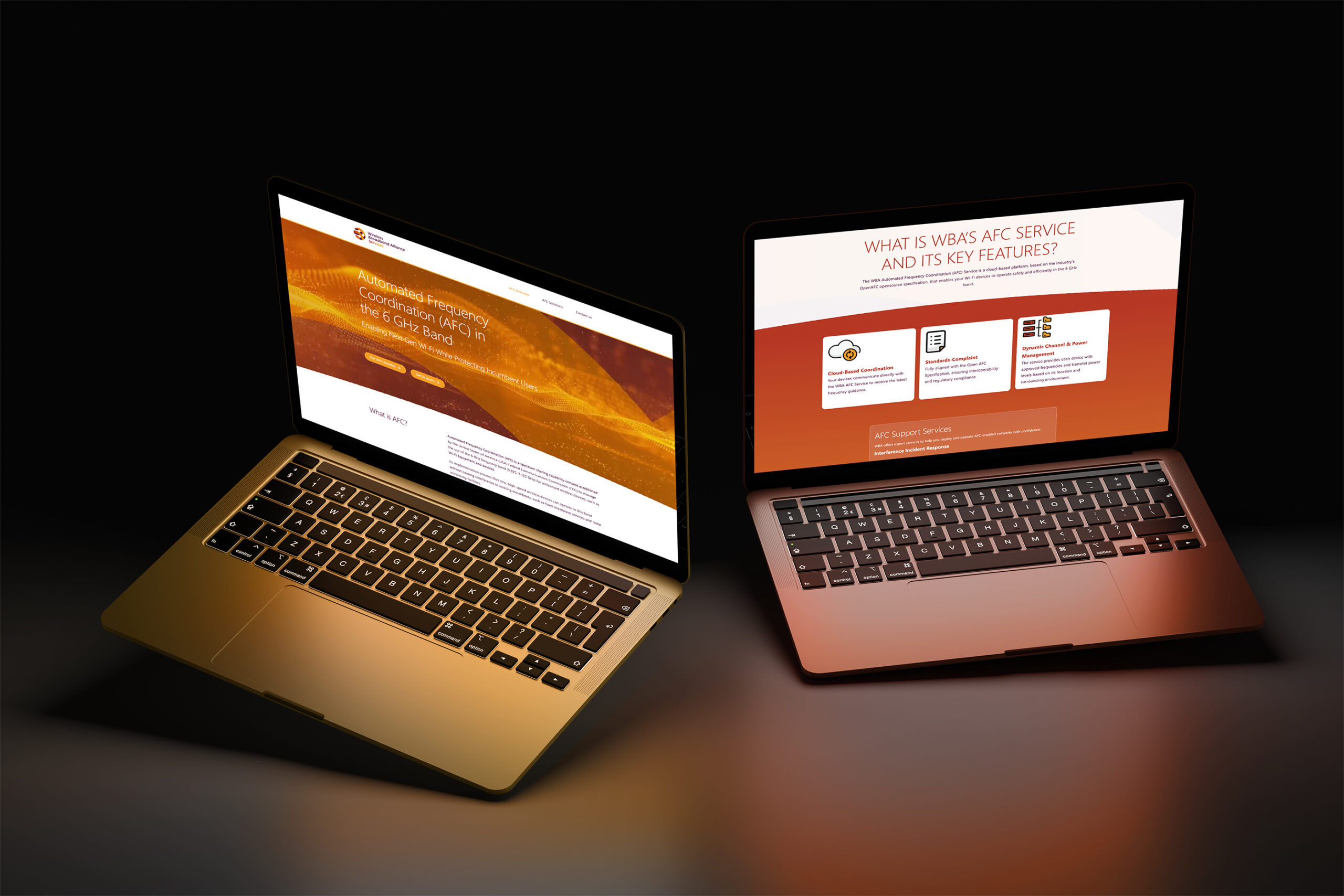
We designed and developed the wballianceservices.com site to serve as both an educational hub and a conversion tool. Its structure reflects WBA Services’ forward-looking approach: streamlined navigation, punchy messaging, and elegant UI components that guide users through AFC’s features and benefits.
Special focus was given to illustrating how the platform works. We incorporated custom diagrams and iconography to explain spectrum coordination and device interactions presented in a clean, modern aesthetic to match the brand.
Final Thoughts
Our partnership with the Wireless Broadband Alliance continues to be one of collaboration, ambition, and shared purpose. With the launch of WBA Services the organisation has entered a new phase, one that combines industry leadership with commercial delivery.
We’re proud to have supported this transition with a brand identity and marketing ecosystem that not only reflects the technology behind AFC but helps drive its global adoption.
If you’re looking to elevate your brand through compelling design and strategic thinking, we’d love to talk. At Fresh01, we design with purpose, clarity, and results. Contact us here.
At Fresh01, we thrive on opportunities to partner with forward-thinking organisations who are shaping the future through technology. Our long-standing relationship with the Wireless Broadband Alliance (WBA) has already seen us deliver branding and digital solutions for their main organisation and global events. So when they launched their new commercial arm, WBA Services, we were excited to step in and bring this entity to life through strategic, considered design.
WBA Services was established to launch and manage the Wireless Broadband Alliance’s Automated Frequency Coordination (AFC) platform, a commercial service enabling standard power Wi-Fi in the 6 GHz band. It’s a major technical leap, and our role was to translate that innovation into a clear, confident brand identity and marketing platform.
A Distinct Identity Within a Global Brand
Our brief was twofold: create a visual identity that maintains the credibility of the WBA brand, while distinguishing WBA Services as a commercial entity with a focused offering. The logo was the first, and most crucial, step in this evolution.
We began with the existing WBA wordmark and globe device, symbols of established global connectivity, and built on them to communicate WBA Services’ new focus on delivery, agility and commercial scale. A key part of that transformation came through colour.
To set WBA Services apart visually while staying connected to the parent brand, we developed a bold new colour scheme built around three key tones:
-
Maple Red – This rich, grounded red brings a sense of authority and dependability. It subtly connects back to WBA’s established trust and leadership in the wireless industry, while introducing a more grounded, purposeful tone suited to the Services brand.
-
Signal Orange – A vibrant, high-energy hue drawing immediate attention and suggests agility, innovation, and forward momentum, perfect for a brand driving high-impact technology adoption.
-
The Gradient Transition – Perhaps the most distinctive feature, this smooth gradient between orange and maple red provides more than visual flair. It serves as a subtle metaphor for spectrum coordination, the fluid transition of power levels and frequencies the AFC platform manages in real time.
This colour story does more than decorate. It conveys purpose, positioning WBA Services as a trusted yet dynamic force in wireless infrastructure, capable of supporting everything from smart cities to enterprise networks and Wi-Fi 7 deployments.
By combining warmth with confidence, we ensured the brand palette not only looks beautiful across web and print, but also reinforces the message at every touchpoint: this is innovation with intent.

Building a Seamless Digital Platform
With the visual identity established, we moved on to creating a dedicated digital platform for WBA Services. Our objective was to communicate complex technical information in a way that was accessible, clean, and confidently commercial.
We designed and developed the wballianceservices.com site to serve as both an educational hub and a conversion tool. Its structure reflects WBA Services’ forward-looking approach: streamlined navigation, punchy messaging, and elegant UI components that guide users through AFC’s features and benefits.
Special focus was given to illustrating how the platform works. We incorporated custom diagrams and iconography to explain spectrum coordination and device interactions presented in a clean, modern aesthetic to match the brand.

Final Thoughts
Our partnership with the Wireless Broadband Alliance continues to be one of collaboration, ambition, and shared purpose. With the launch of WBA Services the organisation has entered a new phase, one that combines industry leadership with commercial delivery.
We’re proud to have supported this transition with a brand identity and marketing ecosystem that not only reflects the technology behind AFC but helps drive its global adoption.
If you’re looking to elevate your brand through compelling design and strategic thinking, we’d love to talk. At Fresh01, we design with purpose, clarity, and results. Contact us here.

