Getting Started
Every good branding project begins with solid research. For Deep Fryed Films, we kicked things off by diving into what’s already out there—identifying what worked, what didn’t, and how we could create something unique based on their vision.
Sketching Out Ideas
With the research in hand, we got down to sketching. We explored 20-30 different concepts, experimenting with various ideas that aligned with the brief. After refining these sketches, we brought them into Adobe Illustrator, narrowing them down to nine solid concepts. Each design had its own style but shared the same underlying themes.
Exploring Concepts
We had fun blending elements from both the culinary and film worlds. Think popcorn buckets crossed with camera rolls, clapperboards mixed with kitchen tools, and even a more straightforward ‘sticker’ design as a simpler alternative. Each concept offered a different take on how to visually represent Deep Fryed Films.
Refining the Design
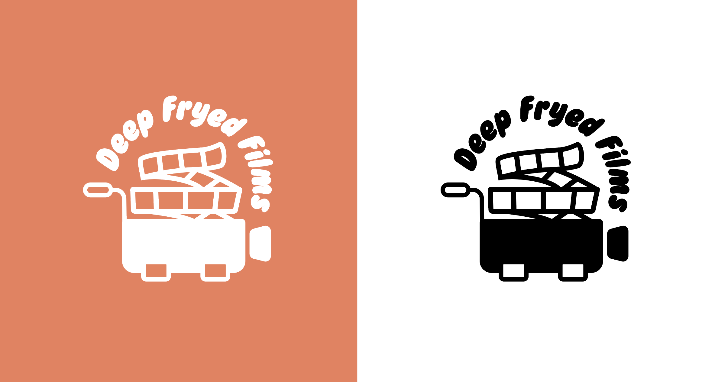
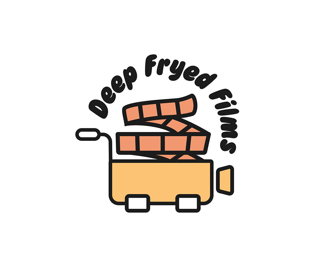
From there, the process was smooth. The client was receptive to the designs and quickly identified a couple of clear favorites. We refined these options, honing in on the details until we landed on a final logo. The result? A fun, dynamic design that seamlessly combines the deep fryer, film reel, and camera elements.
Final Thoughts
This project was a blast to work on, and we’re thrilled with the outcome. The final logo captures the playful yet professional spirit of Deep Fryed Films perfectly.

