Reading Festival just wrapped up, and beyond the energy and live performances, it offered a vibrant showcase of how bands use visual branding to express identity and connect with fans in an instant. Let’s look at four eye-catching acts and what their visuals tell us about their musical worlds.
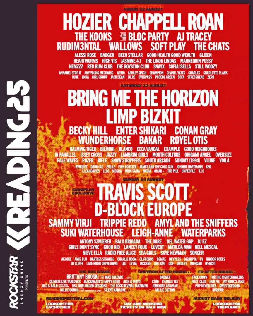
Image credit: Reading Festival Official Website, Reading Festival 2025 Lineup Poster
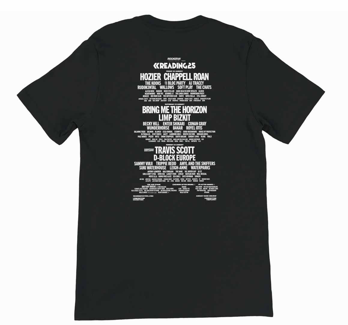
Credit: Reading & Leeds Festival Store, 2025 Line-Up T-Shirt
Sofia Isella: Unease in Aesthetic
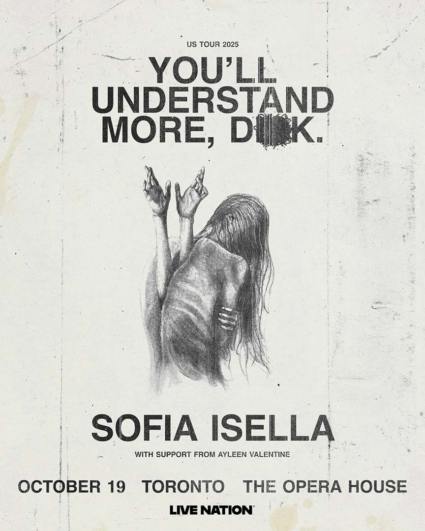
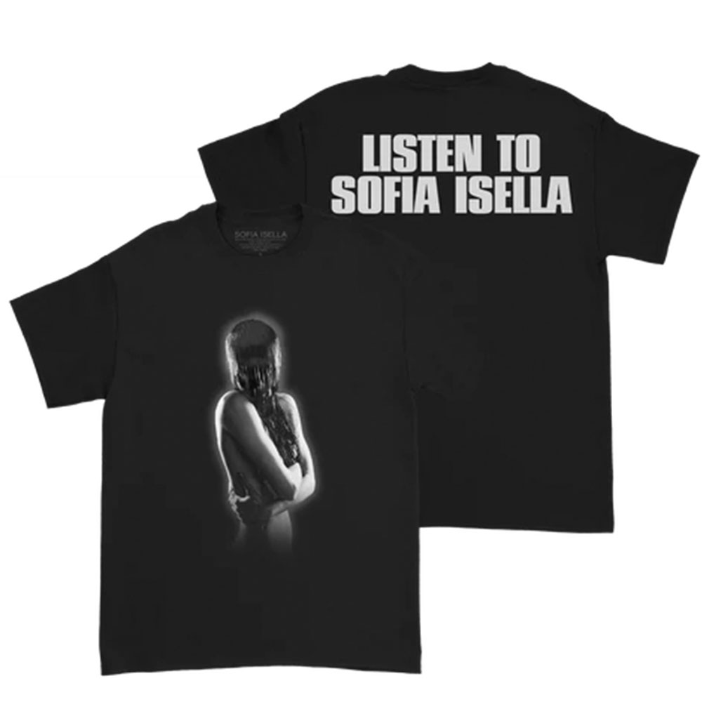
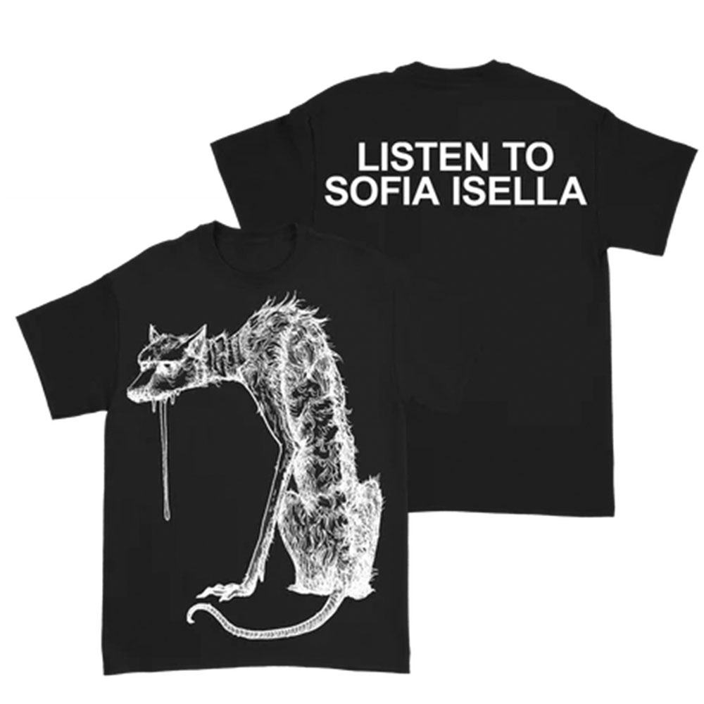
Sofia Isella’s branding taps into the uncanny. Her posters and merch lean into unsettling shapes, cryptic illustrations, and dark, textured graphics that feel creeping yet compelling. Think distorted line drawings, fractured typography, and eerie elements that hover between beauty and distortion.
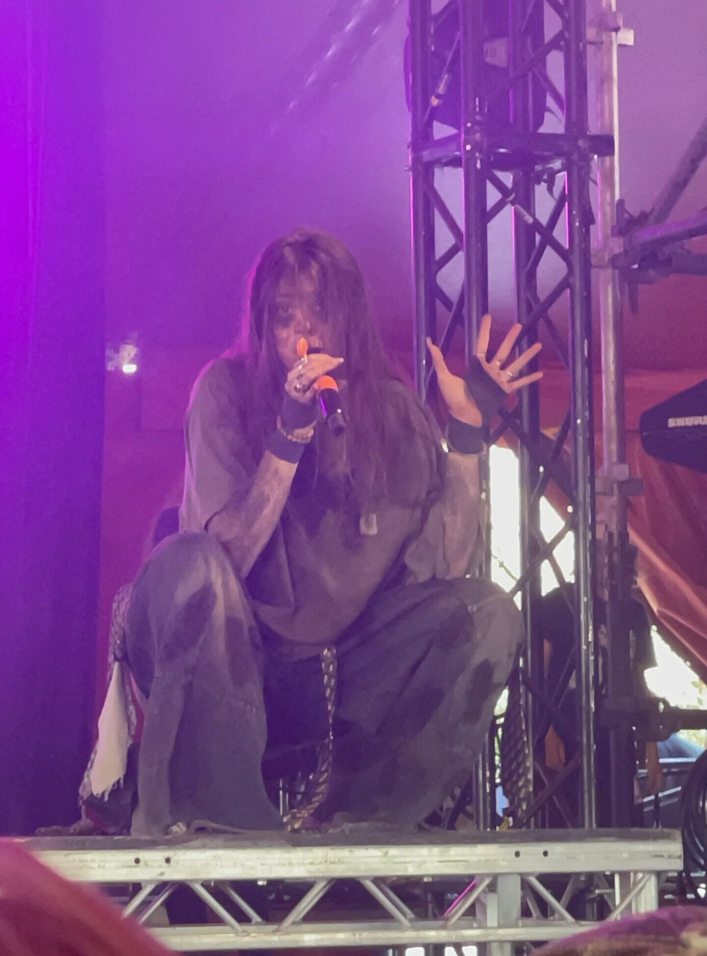
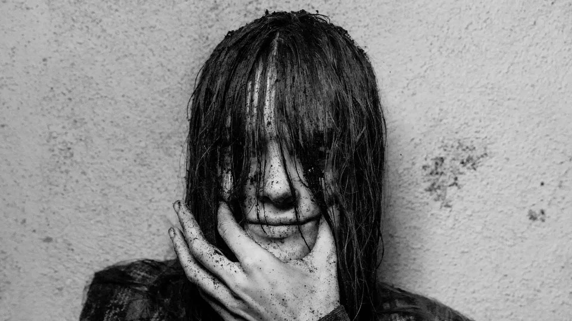
That eerie atmosphere carries directly into her live performances. On stage, she often appears covered in dirt, using the imagery of decay and raw earthiness to make her presence as visually unsettling as it is musically haunting. It’s not random shock value, it ties directly into her brand narrative. The dirt symbolises discomfort, vulnerability, and a stripping away of polish, aligning perfectly with the jagged edges and imperfect textures of her visual identity.
This kind of design tells us something powerful: her sound and presence aren’t about comfort. They’re about the atmosphere. Every visual choice, jagged edges, muted palettes, almost hand-scribbled fonts, signals intrigue, mystery, and tension. It’s an invitation to step into something unsettling and unforgettable.
Credit: Sofia Isella, Instagram
Credit: Sofia Isella Official Merch, Manhead Merch Store
Credit: Sofia Isella Official Merch, Manhead Merch Store
The Chats: Colourful Chaos
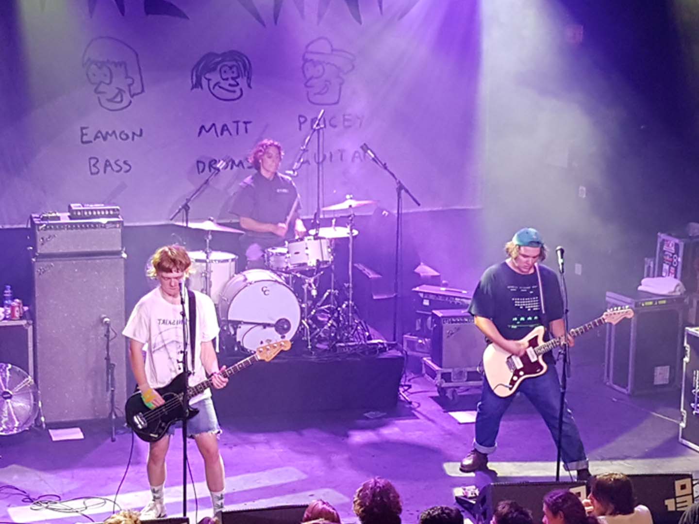
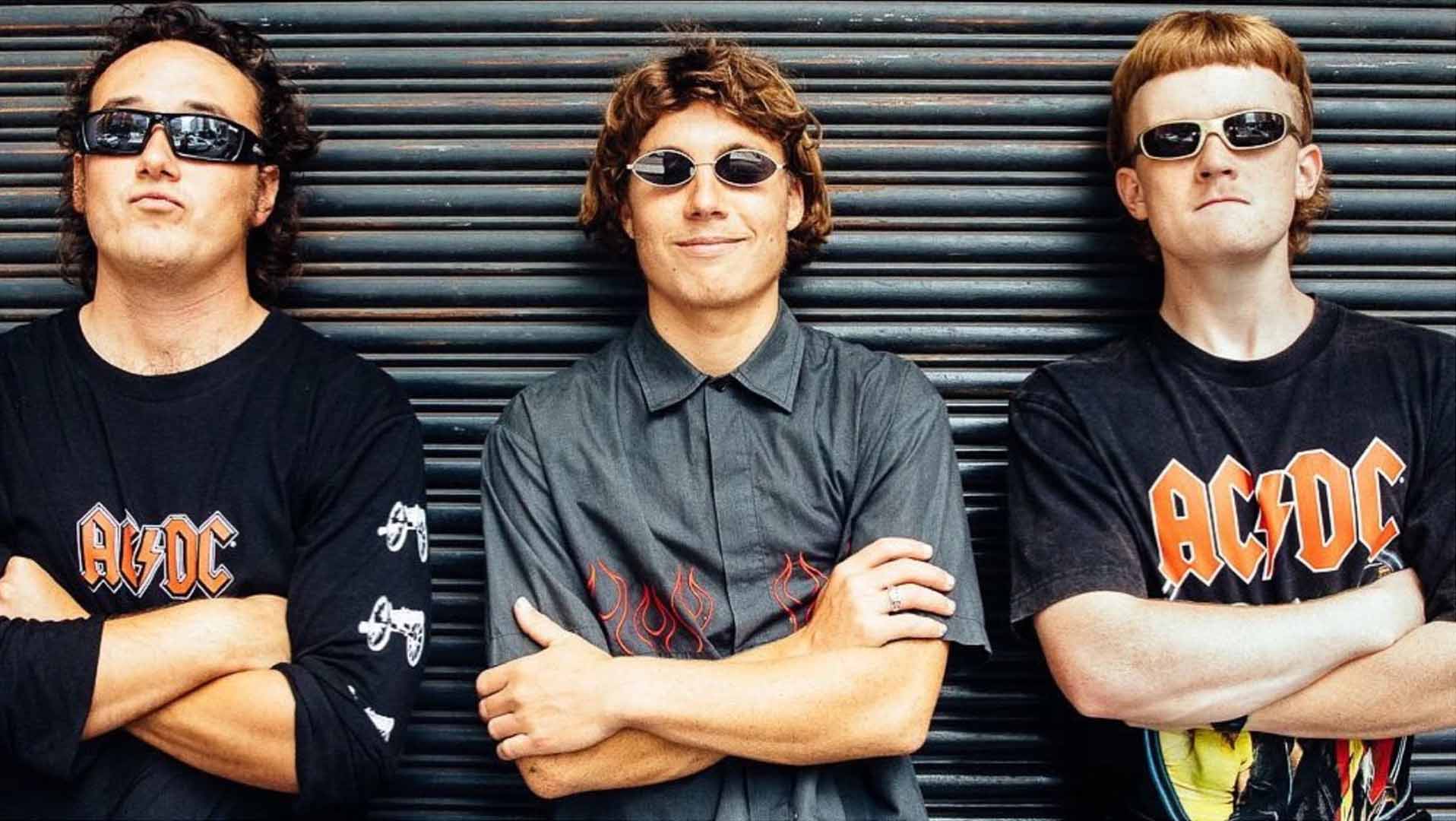
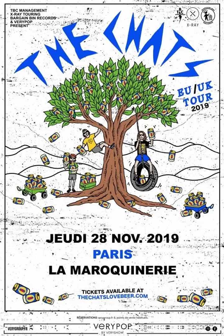
In contrast, The Chats lean hard into a playful, doodle-heavy aesthetic. Their posters and t-shirt designs look like someone grabbed a giant marker and went wild, bright colours, chaotic layouts, hand-scrawled copy, and angry little sketches everywhere.
Credit: The Chats, Wikipedia (used under Wikimedia Commons license)
Credit: The Chats, Wiggles Fandom
This DIY style matches their music perfectly: loud, energetic, irreverent. It’s inviting and inclusive, like they’re saying, “This is fun, messy, and homemade. Join us.” The amateurish skip of a line or scrawled note feels celebratory, not sloppy.
Credit: The Chats EU/UK Tour Poster by Bridie Coughlin, thechatslovebeer.com
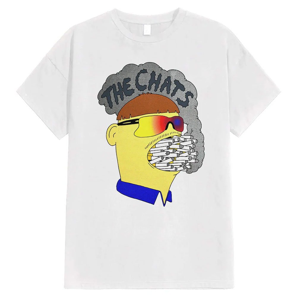
Credit: The Chats Official Store, thechats.store
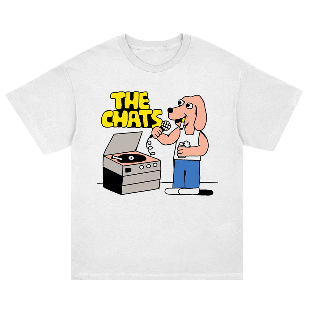
Credit: The Chats Official Store, thechats.store
Chappell Roan: Retro Elegance
Chappell Roan offers something entirely different, a sleek retro aesthetic that feels like a vintage poster come to life. Picture bold serif or script logotypes, a limited colour palette, and glossy, glam-influenced textures that invoke 1960s or 70s pop posters.
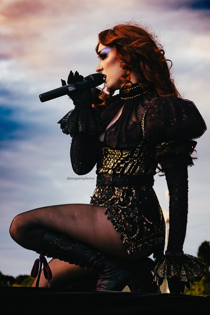
Credit: Chappell Roan, Instagram @chappellroanhub
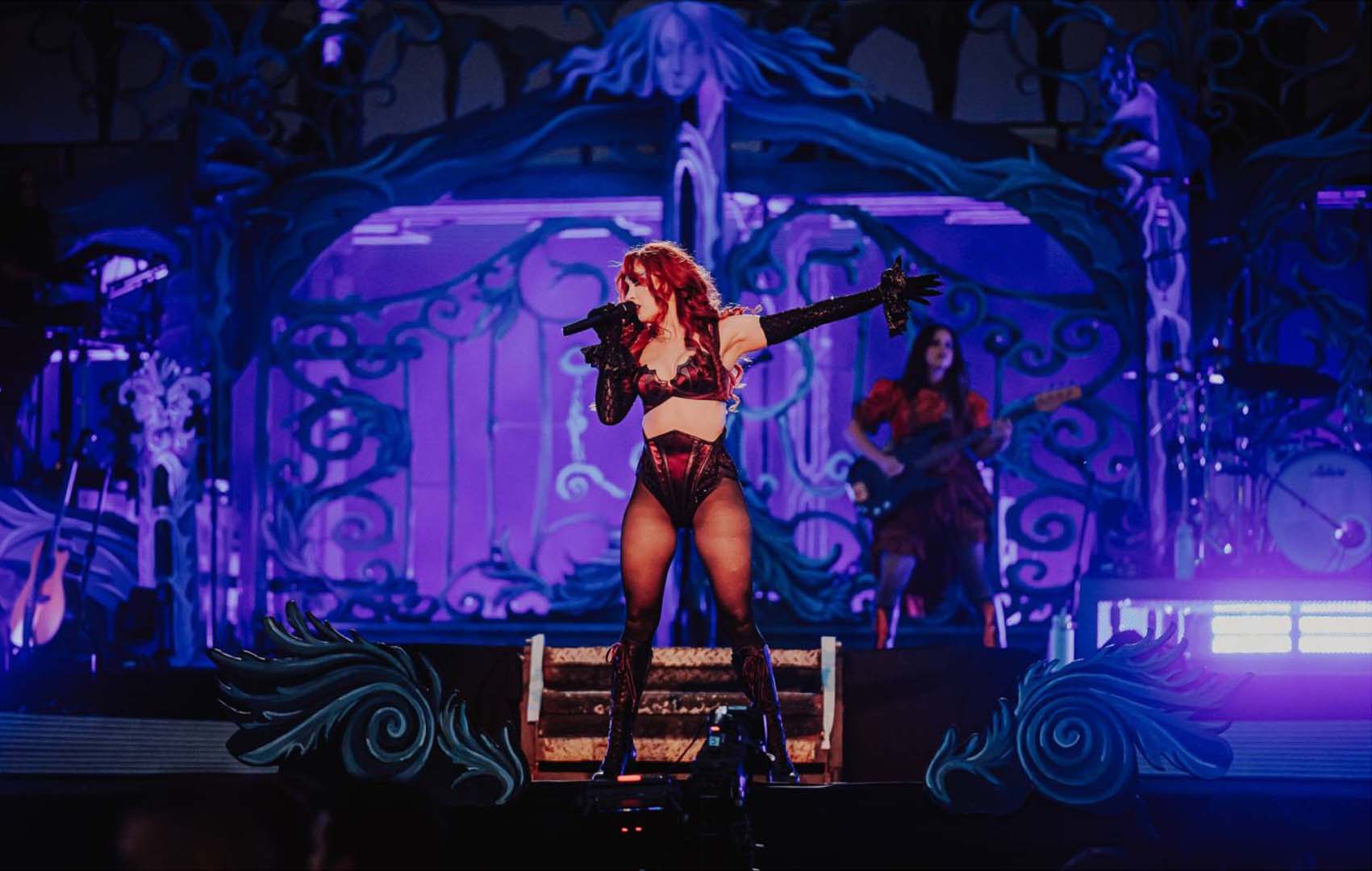
Credit: Luke Dyson / Reading Festival
This visual direction blends nostalgia with a modern edge. Her branding comes across as glamorous and theatrical, with a confident sense of showmanship. On stage, it channels vintage elegance while still feeling fresh, adding a playful layer of retro charm that elevates her performance.
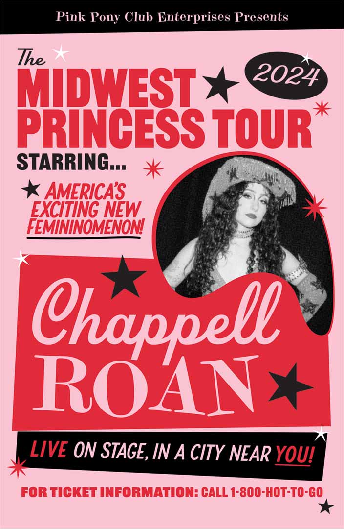
Credit: Chappell Roan “The Midwest Princess Tour” Poster by Shelby Moring, PosterSpy
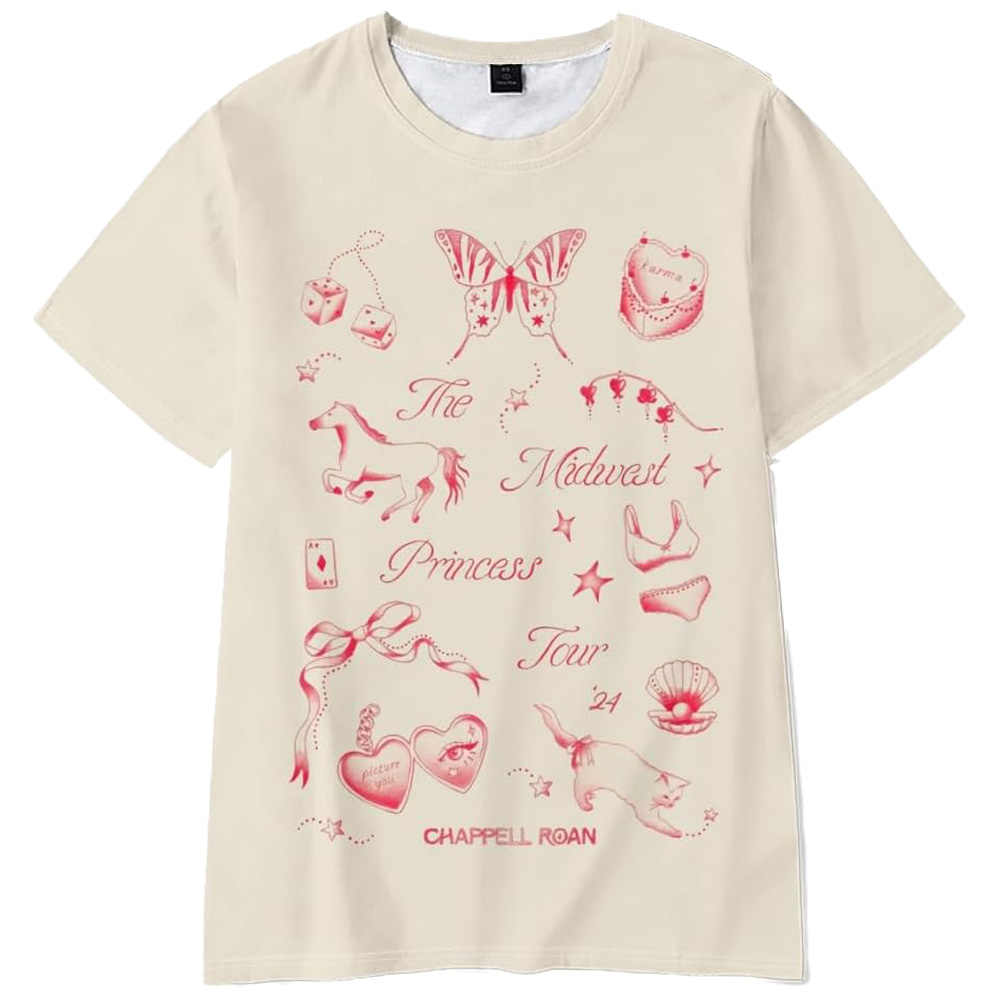
Credit: Chappell Roan Official Store, shopuk.iamchappellroan.com
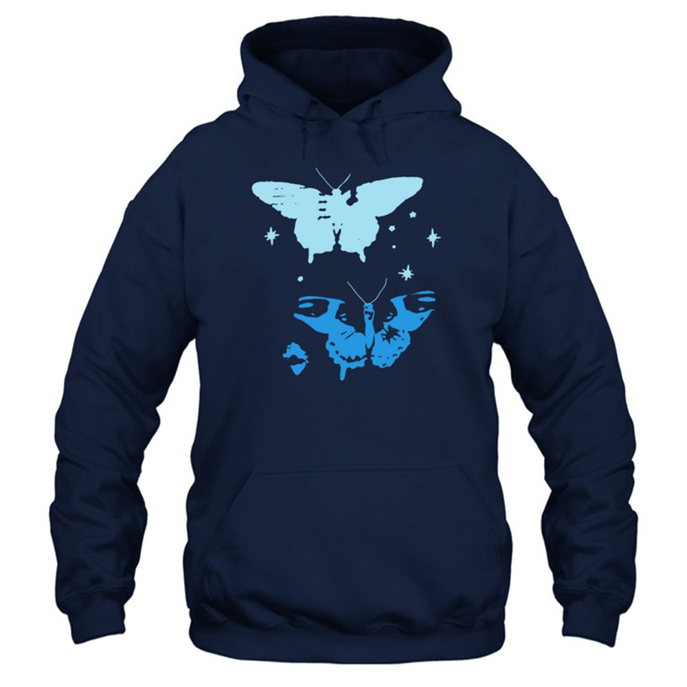
Credit: Chappell Roan Official Store, shopuk.iamchappellroan.com
Bakar: Minimalist Style, Maximum Impact
Bakar brings a very different energy to his branding, leaning on a minimalist, fashion-forward aesthetic. His visuals often focus on clean typography, high-contrast imagery, and stripped-back design that feels deliberate and confident. The effect is stylish and modern, letting the music and persona speak without distraction.
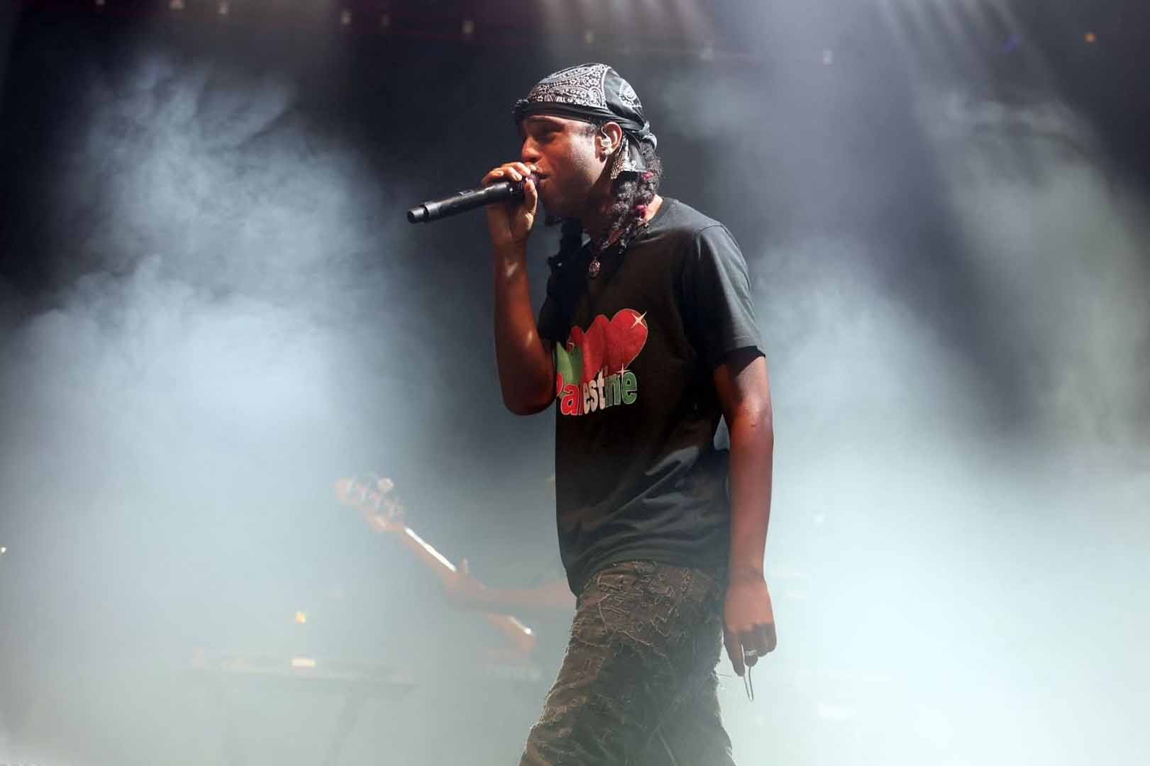
Credit: Bakar, Wikipedia (used under Wikimedia Commons license)
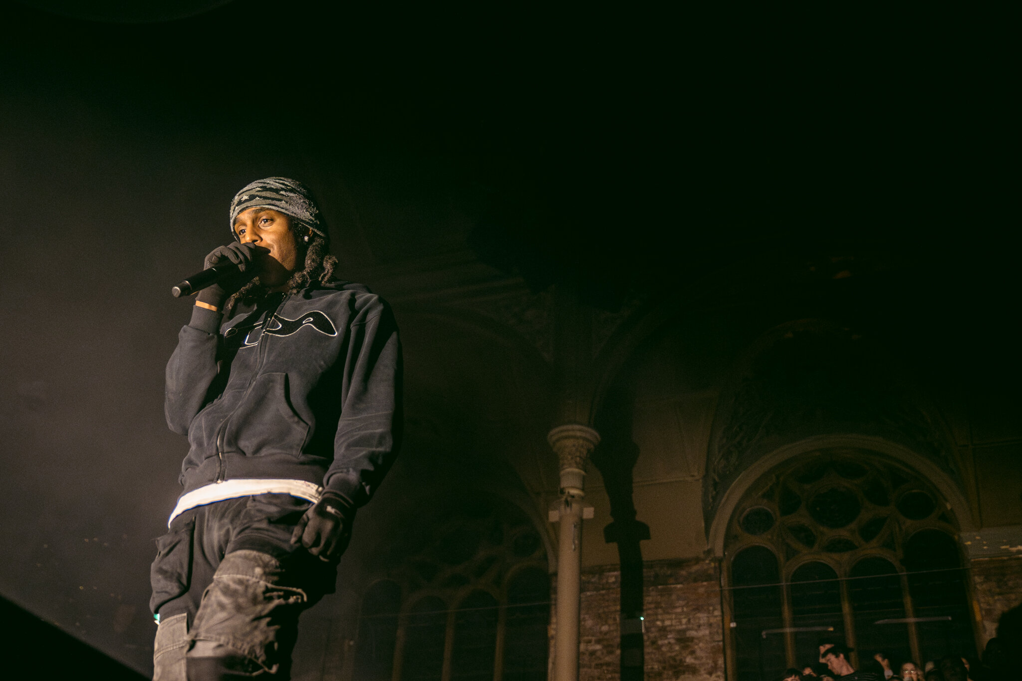
Credit: Georgina Hurdsfield / AAH Magazine, Bakar Live at Albert Hall
His approach shows how branding doesn’t need to be busy to be powerful. By embracing restraint and clarity, Bakar creates a visual identity that feels timeless and distinctive, standing out precisely because of its simplicity.
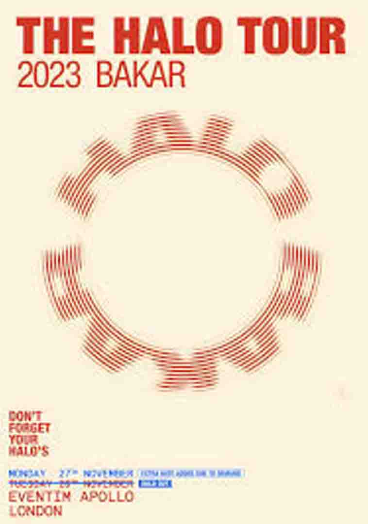
Credit: Bakar, Instagram
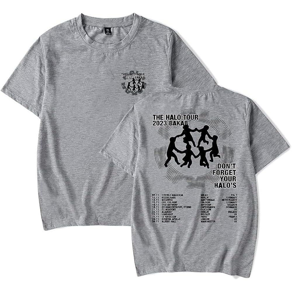
Credit: Bakar Official Merch, Merchbar
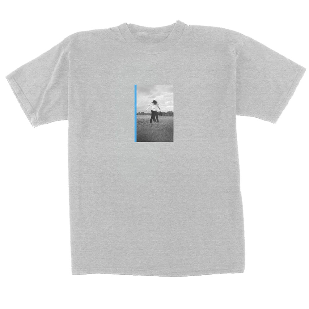
Credit: Bakar Official Merch, Merchbar
Why Visual Branding Matters, Even (or Especially) at Festivals
At festivals like Reading, where dozens of acts compete for attention, branding becomes essential. Visual identity acts as a silent introduction before the first note is played. Posters, merch, stage backdrops, and social media tiles all work to:
- Build instant recognition
- Signal genre, tone, or vibe without words
- Create emotional hooks that prepare fans before the music begins
Whether it’s eerie textures, doodle-style chaos, retro elegance, or minimalist style, these design choices help audiences feel the artist before they even listen.
Final Thought
Graphic design isn’t just decoration, it’s storytelling. At Reading Festival this year, Sofia Isella, The Chats, Chappell Roan, and Bakar each told a story visually that perfectly framed their musical identity. These examples remind us that great design doesn’t just look good, it sounds like the band too.
Reading Festival just wrapped up, and beyond the energy and live performances, it offered a vibrant showcase of how bands use visual branding to express identity and connect with fans in an instant. Let’s look at four eye-catching acts and what their visuals tell us about their musical worlds.

Image credit: Reading Festival Official Website, Reading Festival 2025 Lineup Poster

Credit: Reading & Leeds Festival Store, 2025 Line-Up T-Shirt
Sofia Isella: Unease in Aesthetic
Sofia Isella’s branding taps into the uncanny. Her posters and merch lean into unsettling shapes, cryptic illustrations, and dark, textured graphics that feel creeping yet compelling. Think distorted line drawings, fractured typography, and eerie elements that hover between beauty and distortion.


That eerie atmosphere carries directly into her live performances. On stage, she often appears covered in dirt, using the imagery of decay and raw earthiness to make her presence as visually unsettling as it is musically haunting. It’s not random shock value, it ties directly into her brand narrative. The dirt symbolises discomfort, vulnerability, and a stripping away of polish, aligning perfectly with the jagged edges and imperfect textures of her visual identity.
This kind of design tells us something powerful: her sound and presence aren’t about comfort. They’re about the atmosphere. Every visual choice, jagged edges, muted palettes, almost hand-scribbled fonts, signals intrigue, mystery, and tension. It’s an invitation to step into something unsettling and unforgettable.

Credit: Sofia Isella, Instagram

Credit: Sofia Isella Official Merch, Manhead Merch Store

Credit: Sofia Isella Official Merch, Manhead Merch Store
The Chats: Colourful Chaos
In contrast, The Chats lean hard into a playful, doodle-heavy aesthetic. Their posters and t-shirt designs look like someone grabbed a giant marker and went wild, bright colours, chaotic layouts, hand-scrawled copy, and angry little sketches everywhere.

Credit: The Chats, Wikipedia (used under Wikimedia Commons license)

Credit: The Chats, Wiggles Fandom
This DIY style matches their music perfectly: loud, energetic, irreverent. It’s inviting and inclusive, like they’re saying, “This is fun, messy, and homemade. Join us.” The amateurish skip of a line or scrawled note feels celebratory, not sloppy.

Credit: The Chats EU/UK Tour Poster by Bridie Coughlin, thechatslovebeer.com

Credit: The Chats Official Store, thechats.store

Credit: The Chats Official Store, thechats.store
Chappell Roan: Retro Elegance
Chappell Roan offers something entirely different, a sleek retro aesthetic that feels like a vintage poster come to life. Picture bold serif or script logotypes, a limited colour palette, and glossy, glam-influenced textures that invoke 1960s or 70s pop posters.

Credit: Chappell Roan, Instagram @chappellroanhub

Credit: Luke Dyson / Reading Festival
This visual direction blends nostalgia with a modern edge. Her branding comes across as glamorous and theatrical, with a confident sense of showmanship. On stage, it channels vintage elegance while still feeling fresh, adding a playful layer of retro charm that elevates her performance.

Credit: Chappell Roan “The Midwest Princess Tour” Poster by Shelby Moring, PosterSpy

Credit: Chappell Roan Official Store, shopuk.iamchappellroan.com

Credit: Chappell Roan Official Store, shopuk.iamchappellroan.com
Bakar: Minimalist Style, Maximum Impact
Bakar brings a very different energy to his branding, leaning on a minimalist, fashion-forward aesthetic. His visuals often focus on clean typography, high-contrast imagery, and stripped-back design that feels deliberate and confident. The effect is stylish and modern, letting the music and persona speak without distraction.

Credit: Bakar, Wikipedia (used under Wikimedia Commons license)

Credit: Georgina Hurdsfield / AAH Magazine, Bakar Live at Albert Hall
His approach shows how branding doesn’t need to be busy to be powerful. By embracing restraint and clarity, Bakar creates a visual identity that feels timeless and distinctive, standing out precisely because of its simplicity.

Credit: Bakar, Instagram

Credit: Bakar Official Merch, Merchbar

Credit: Bakar Official Merch, Merchbar
Why Visual Branding Matters, Even (or Especially) at Festivals
At festivals like Reading, where dozens of acts compete for attention, branding becomes essential. Visual identity acts as a silent introduction before the first note is played. Posters, merch, stage backdrops, and social media tiles all work to:
- Build instant recognition
- Signal genre, tone, or vibe without words
- Create emotional hooks that prepare fans before the music begins
Whether it’s eerie textures, doodle-style chaos, retro elegance, or minimalist style, these design choices help audiences feel the artist before they even listen.
Final Thought
Graphic design isn’t just decoration, it’s storytelling. At Reading Festival this year, Sofia Isella, The Chats, Chappell Roan, and Bakar each told a story visually that perfectly framed their musical identity. These examples remind us that great design doesn’t just look good, it sounds like the band too.

