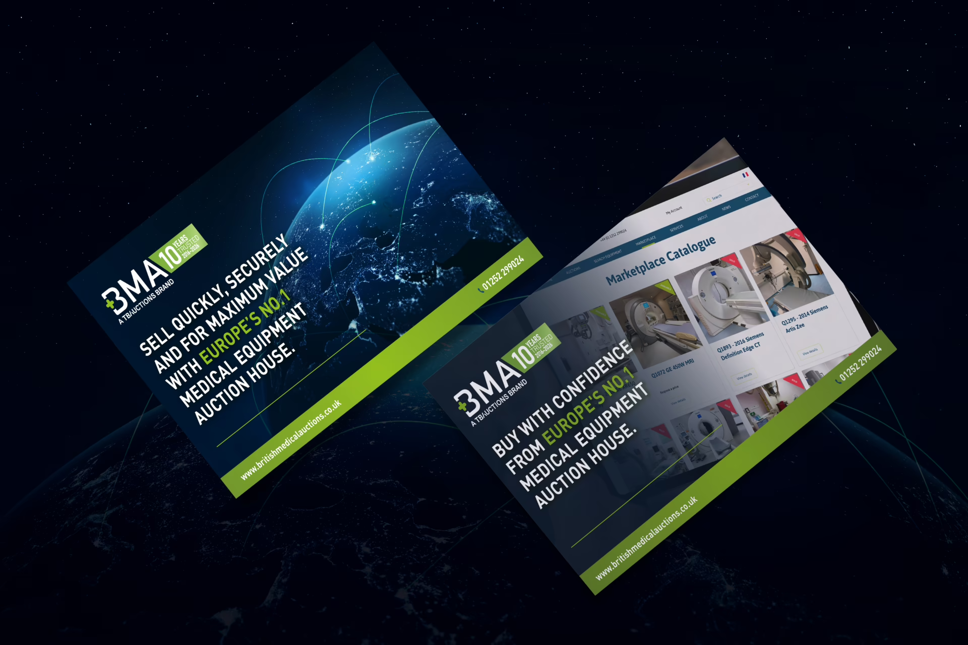

BMA (British Medical Auctions) specialises in the resale of used medical equipment, working with NHS Trusts, private healthcare providers and other healthcare organisations to manage, sell and give equipment a useful next chapter.
With services covering everything from collections and asset management to data erasure, remarketing and resale, there’s quite a lot to communicate. BMA asked us to help turn that offer into two clearer, more engaging sales tools focused on Selling with BMA and Buying with BMA.
Starting with Selling
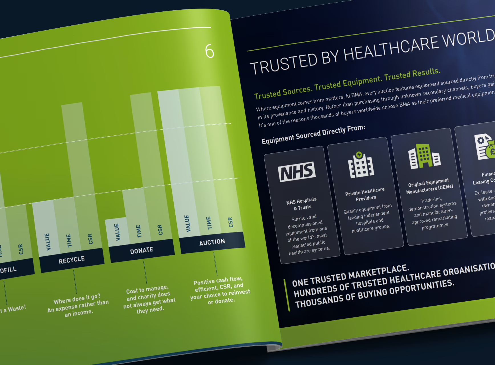
The Selling brochure already existed in Canva, giving BMA a useful base of content to work from. Our task was to take that foundation and develop it into a more considered InDesign layout, giving us greater control over the structure, imagery and consistency across the piece.
Rather than rewriting everything, we worked largely with the supplied content, shortening and refining where needed, breaking larger sections into more digestible pieces and introducing a clearer hierarchy throughout.
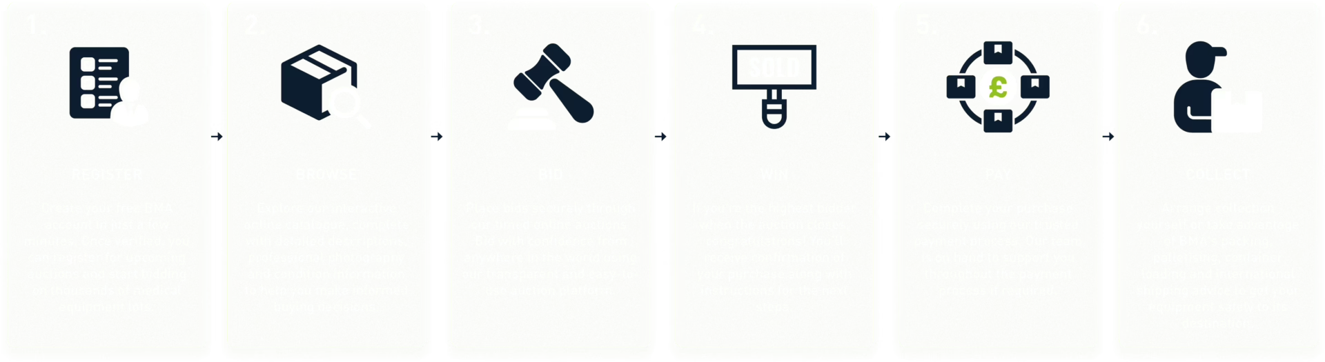
We also created supporting illustrations for key parts of the auction process and comparison information, alongside a set of icons to help identify different services and areas of the business. The aim was simple: make quite a lot of information easier to take in without losing the useful detail.
More than a static PDF
The brochures were always intended to live digitally, eventually sitting within an online page-turning format, so we could think beyond the limitations of a traditional printed document.
Video content was incorporated directly into the layouts, alongside interactive calls to action and contact details. This helped make the brochures feel less like something to simply read and more like practical tools the BMA sales team could use when introducing the business and its services.
The digital format also influenced the pacing of the design. Rather than filling every available space, we could give important messages more room and create a more natural journey through the content.
Evolving the BMA look and feel
As the project developed, there was also an opportunity to push BMA’s visual language a little further.
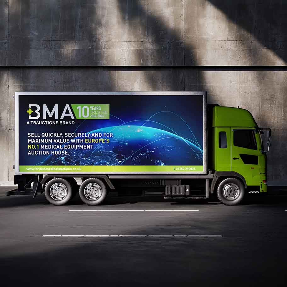
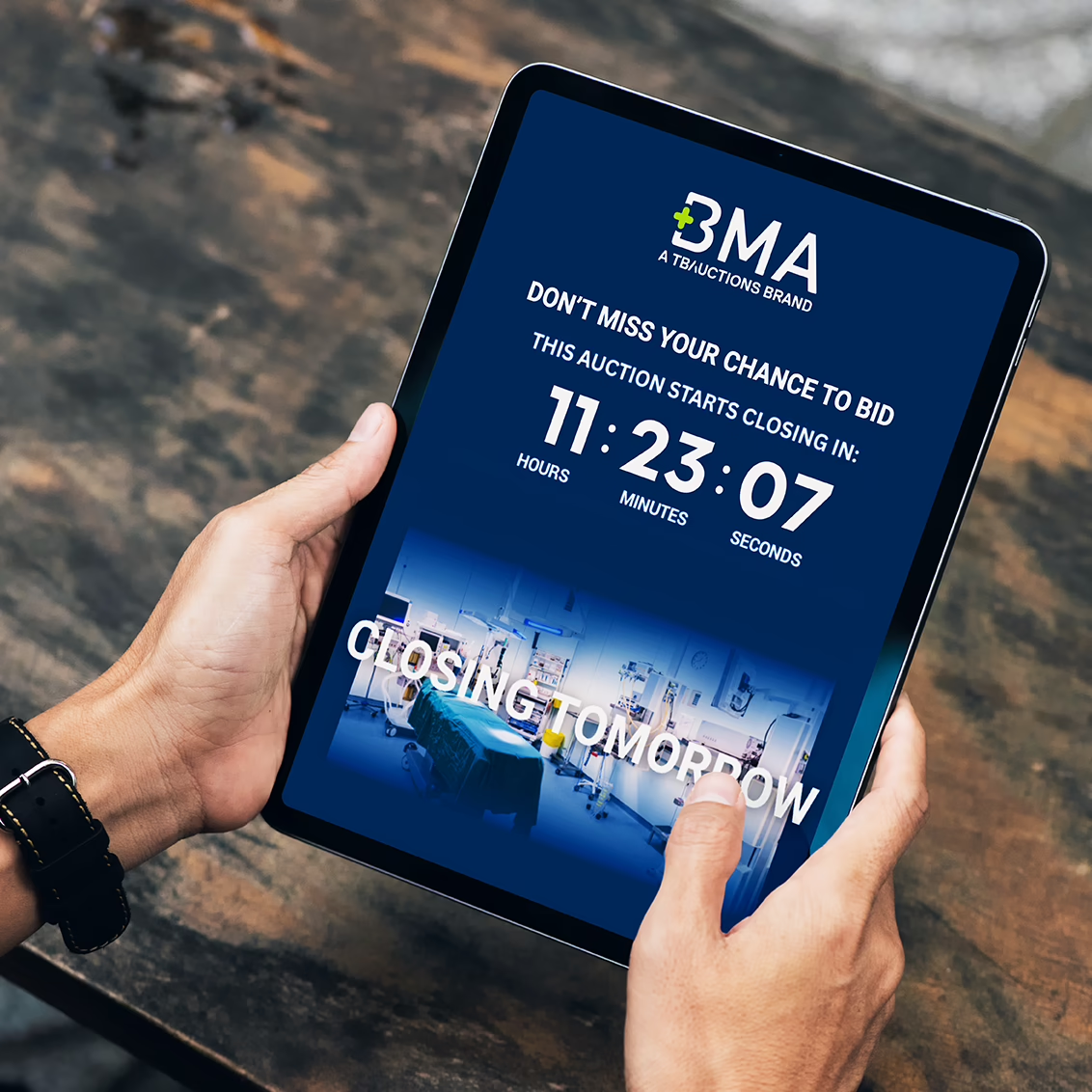
The wider brand style was evolving across other BMA materials at the same time, so we used the brochures to explore how that direction could work across a larger, content-heavy piece. Gradients, transparencies, layered graphics, digital-inspired imagery and updated iconography all helped create something more dynamic and contemporary while still feeling recognisably BMA.
It became a useful bit of brand evolution rather than a wholesale change. We could try new ideas in context, see what worked and gradually establish a broader visual toolkit that could carry into future communications.
From Selling to Buying
Once the Selling brochure had been reviewed and approved, attention turned to Buying with BMA.
There was naturally some shared content between the two, but the emphasis needed to shift towards the buying experience, BMA’s specialist knowledge, available equipment, credentials and partnerships. By this point we had a strong design foundation in place, allowing the two pieces to clearly belong together without simply repeating one another.
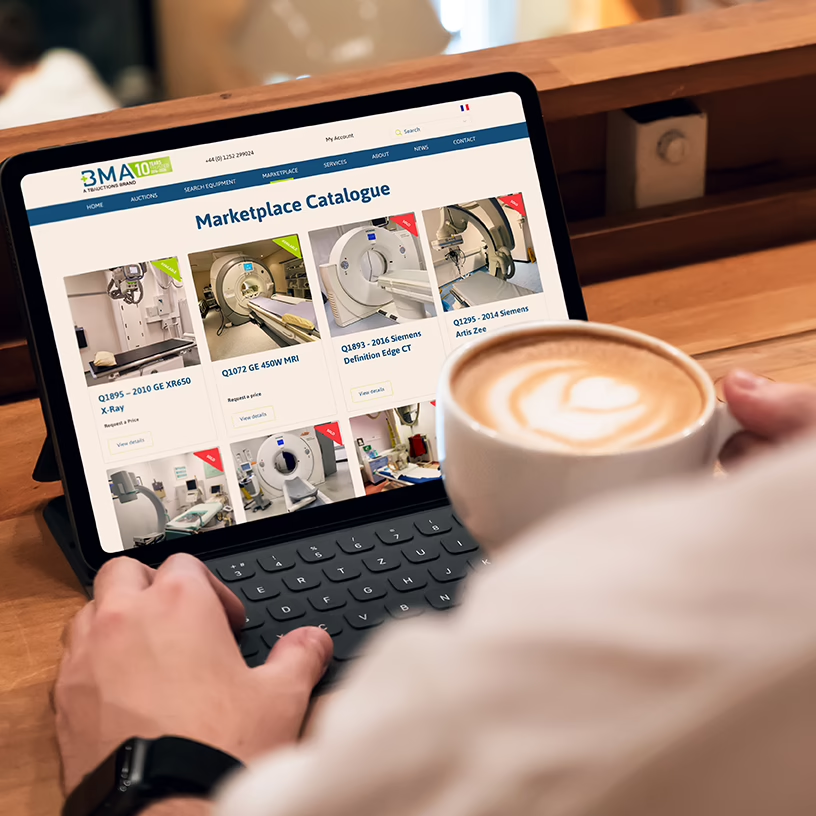
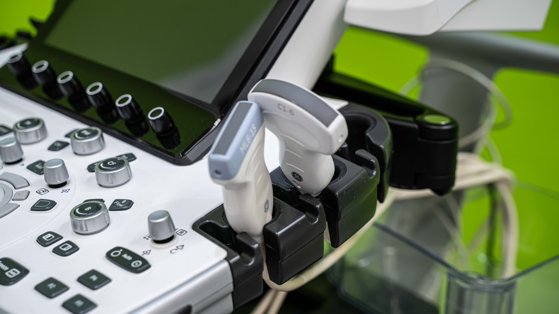
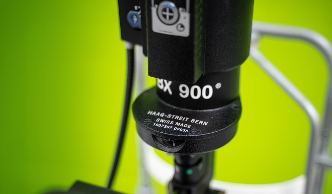
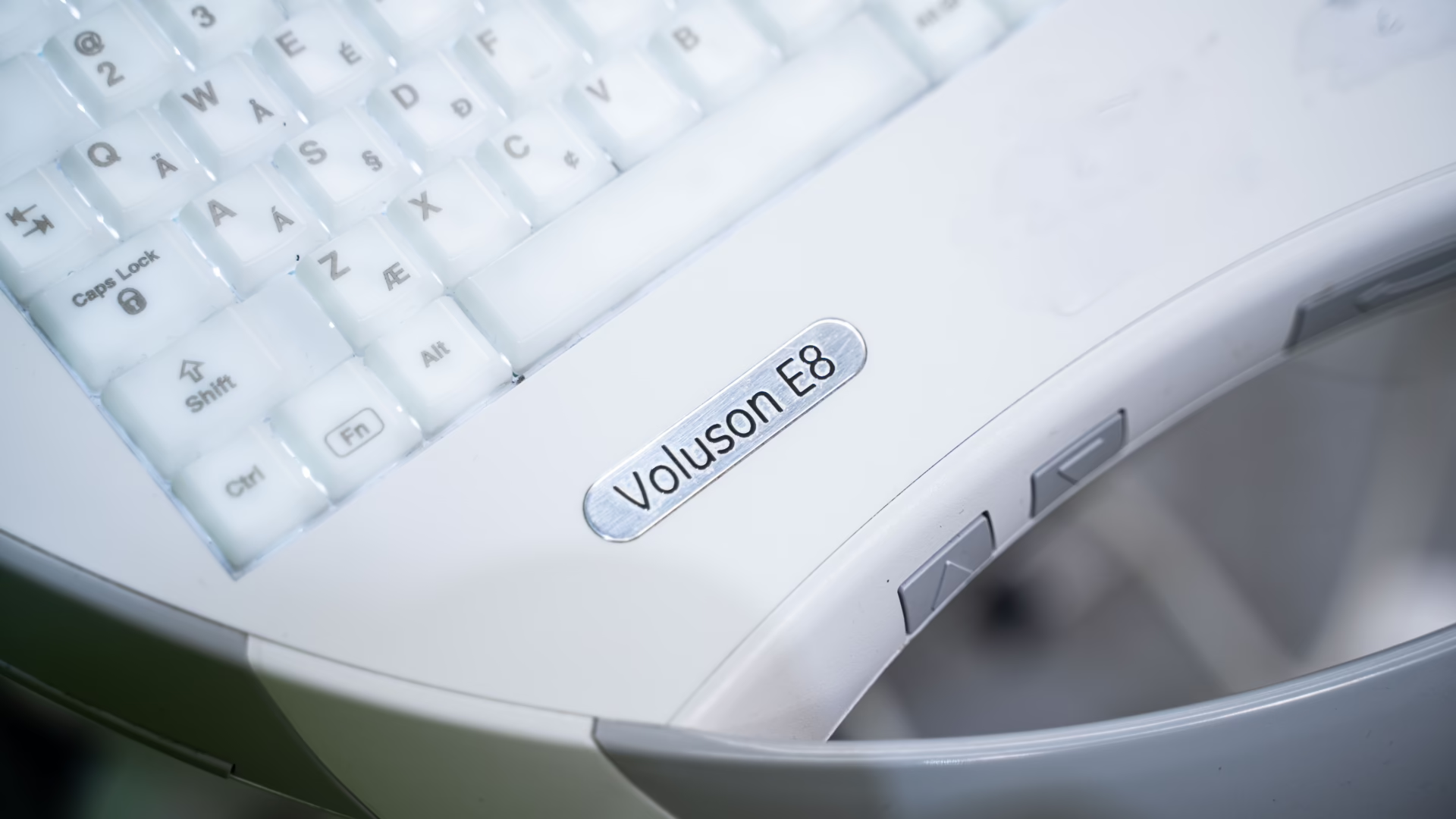
BMA also supplied a large library of product photography which gave us plenty to work with. Selected images were cleaned, extended and retouched, with backgrounds removed and subtle colour treatments added where needed. This allowed the equipment itself to play a much bigger role in the layouts and gave us stronger full-page and background imagery throughout.
Two brochures, one evolving system
Ultimately, these are two practical pieces of sales collateral. We haven’t reinvented the brochure, but the project did give us an opportunity to make them work a lot harder.
By combining clearer content, bespoke graphics, stronger imagery, interactive elements and an evolving visual style, we created two useful tools for BMA while helping develop a more flexible look and feel around the wider brand.
Both Buying with BMA and Selling with BMA are now live on the BMA website and being used as part of the team’s ongoing sales and promotional activity.
For us, that’s probably the most satisfying part of the project. A brand evolution doesn’t always need to begin with a big rebrand exercise. Sometimes it comes from working collaboratively on the everyday materials, trying things in the real world and gradually pushing the identity where it feels right.