When Sangeeta Waldron and Giles Trendle launched The Green House Duo, they had a clear vision but no existing identity. As a new company focused on sustainability, communication, and media, they needed a logo that would reflect their expertise, values, and mission. Something modern, professional, and adaptable for the global impact they aspire to make.
The Need for a Strong Identity
As a dynamic partnership bringing together decades of experience in climate change, corporate social responsibility, media, and communications, Sangeeta and Giles needed an identity that would visually capture the essence of their work. They wanted something that not only represented their passion for sustainability but also their commitment to authenticity, clarity, and global outreach.
With their expertise, they understand the importance of trust in communication, and their logo had to reflect these core values while also being versatile for digital platforms, print, and all their marketing materials.
The Design Process: Shaping Their Vision
Our design process began by working to understand the heart of their company’s mission. Their goal was to empower organisations to communicate authentically, build trust, and showcase their positive impact on people and the planet. We identified the key elements that the logo needed to convey:
- Sustainability: Reflecting their commitment to environmental responsibility and global change.
- Authenticity & Clarity: A modern, clean design that communicates trust and transparency.
- Global Reach: A logo that would resonate across cultures and be adaptable for a wide range of mediums and markets.
After brainstorming various concepts, experimenting with natural imagery and organic shapes, while focusing on a simple, timeless design that would speak to their values of clarity and growth. We explored various design concepts that would visually reflect the unique partnership of the team.
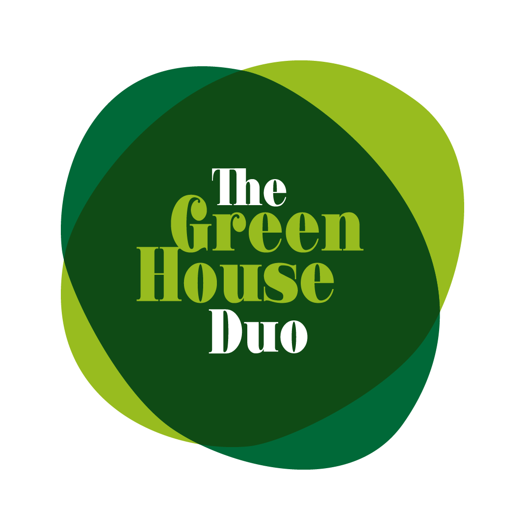
The Final Logo: A Visual Identity Built for Impact
After refining several design ideas, we focussed on a logo that truly captures the spirit of The Green House Duo. Combining clean, modern typography with a fresh green colour palette that symbolises sustainability, growth, and environmental responsibility. It represents both the idea of connection and protection, echoing the duo’s role in bridging gaps and empowering others to share their stories effectively.
Building the website: Translating the Brand into a Digital Experience
The online goal was to ensure the core elements, the organic shapes, the fresh green tones, and the clear typography, would seamlessly translate into a digital experience that felt just as impactful and authentic as their new logo.
The website design is a simple, one page site, with a focus on storytelling and clear communication. We made sure the visual identity was carried through every aspect of the page, including using the organic shapes that echo throughout, reinforcing the idea of growth, unity, and sustainability.

Looking Ahead: Building a Brand with Purpose
Fresh01 are excited to see where their journey takes them and proud to have played a part in creating an identity that reflects their passion for sustainability and global change.
Check out the site here!